ATD Blog
10 Ways to Improve Your Infographics
Tue Oct 11 2022
Content
Why are we fascinated with infographics? Perhaps it’s because well-designed visualizations can help us understand large data sets and complex concepts. They condense information into something manageable.
Why are we fascinated with infographics? Perhaps it’s because well-designed visualizations can help us understand large data sets and complex concepts. They condense information into something manageable.
Content
In his book, The Functional Art , Alberto Cairo writes, “The first and main goal of any graphic and visualization is to be a tool for your eyes and brain to perceive what lies beyond their natural reach.”
In his book, The Functional Art, Alberto Cairo writes, “The first and main goal of any graphic and visualization is to be a tool for your eyes and brain to perceive what lies beyond their natural reach.”
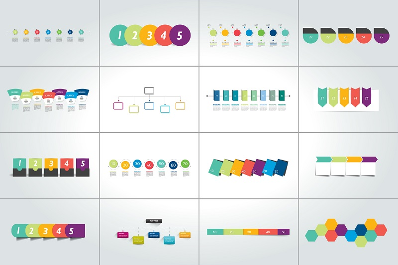
Quantitative Versus Qualitative Infographics
Content
Infographics visualize both quantitative and qualitative content.
Infographics visualize both quantitative and qualitative content.
Content
Quantitative refers to anything you can measure. Think of graphs, data visualizations, statistical maps, and similar formats. These infographics transform numbers into something concrete.
Quantitative refers to anything you can measure. Think of graphs, data visualizations, statistical maps, and similar formats. These infographics transform numbers into something concrete.
Content
Qualitative infographics visualize objects, concepts, and ideas. They use charts, diagrams and illustrations to enhance understanding.
Qualitative infographics visualize objects, concepts, and ideas. They use charts, diagrams and illustrations to enhance understanding.
Content
Hybrid infographics include both types.
Hybrid infographics include both types.
Designing and Interpreting Infographics
Content
When you design quantitative infographics, you encode the values of the data into points, lines, shapes, and colors. You might show the value of each data point as a circle in a line graph on a coordinate scale with the color of the line indicating the category of data.
When you design quantitative infographics, you encode the values of the data into points, lines, shapes, and colors. You might show the value of each data point as a circle in a line graph on a coordinate scale with the color of the line indicating the category of data.
Content
When you design qualitative infographics, particularly charts and diagrams, you encode concepts into their spatial features. For example, you may place elements in close proximity to show there is a relationship between them. Or you might place an object at the top of a hierarchical chart to show its importance.
When you design qualitative infographics, particularly charts and diagrams, you encode concepts into their spatial features. For example, you may place elements in close proximity to show there is a relationship between them. Or you might place an object at the top of a hierarchical chart to show its importance.
Content
Here’s a process and some guidelines to help beginners design effective infographics:
Here’s a process and some guidelines to help beginners design effective infographics:
Content
Have a plan.
Have a plan.
Content
Analyze the need and goal. Consider whether a visualization will help your audience understand the information you want to present. If an infographic will help them fulfill an instructional goal, go forward with the learner in mind. If not, stop before you commit to a method that may not be the most effective learning mechanism.
Analyze the need and goal. Consider whether a visualization will help your audience understand the information you want to present. If an infographic will help them fulfill an instructional goal, go forward with the learner in mind. If not, stop before you commit to a method that may not be the most effective learning mechanism.
Content
Consider the graphic literacy of the audience. Select a visual format that learners will understand. For most audiences, choose common formats that you see in popular media. Use conventional icons and symbols so that the infographic is easy to process mentally.
Consider the graphic literacy of the audience. Select a visual format that learners will understand. For most audiences, choose common formats that you see in popular media. Use conventional icons and symbols so that the infographic is easy to process mentally.
Content
Choose the right format for your information. Infographic formats are designed for specific types of data and content. Some examples include a flowchart that shows a process; a line graph that shows trends over time; or bar graphs that compare quantities.
Choose the right format for your information. Infographic formats are designed for specific types of data and content. Some examples include a flowchart that shows a process; a line graph that shows trends over time; or bar graphs that compare quantities.
Content
There are many online resources to help you choose the best chart type for your needs.
There are many online resources to help you choose the best chart type for your needs.
Content
Organize the layout.
Organize the layout.
Content
Use consistent alignment. Consistently align the graphics and text to the left, right, or centered. Also align the elements of the infographic with each other. You may find that using a designer’s grid helps with this.
Use consistent alignment. Consistently align the graphics and text to the left, right, or centered. Also align the elements of the infographic with each other. You may find that using a designer’s grid helps with this.
Content
Use grouping to show relationships. When you place elements in a group, readers assume there is a relationship between them. Ways to group elements include putting objects close together; using objects that are similar in size, shape, and color; and drawing a boundary around the objects. The reverse is also true. Avoid visual grouping of elements that are not related.
Use grouping to show relationships. When you place elements in a group, readers assume there is a relationship between them. Ways to group elements include putting objects close together; using objects that are similar in size, shape, and color; and drawing a boundary around the objects. The reverse is also true. Avoid visual grouping of elements that are not related.
Content
Be visually efficient.
Be visually efficient.
Content
Increase the signal, and reduce the noise. The signal is your message, and the noise is the unnecessary information. Remove visual elements that distract from the signal, such as a large logo, unnecessary pictures, or superfluous text.
Increase the signal, and reduce the noise. The signal is your message, and the noise is the unnecessary information. Remove visual elements that distract from the signal, such as a large logo, unnecessary pictures, or superfluous text.
Content
Design for universal access . Accommodate learners with visual impairments. Use patterns to distinguish between categories of data rather than color alone. Add labels to all elements. Use maximum contrast between the text and the background. Finally, screen readers cannot interpret the text in an image so provide alt text (a transcript that conveys the information in the image) or create it in HTML/CSS. You can also opt to provide a narrated audio version.
Design for universal access. Accommodate learners with visual impairments. Use patterns to distinguish between categories of data rather than color alone. Add labels to all elements. Use maximum contrast between the text and the background. Finally, screen readers cannot interpret the text in an image so provide alt text (a transcript that conveys the information in the image) or create it in HTML/CSS. You can also opt to provide a narrated audio version.
Content
Choose a clean, legible font. The titles, labels, and explanations in an infographic can be key to understanding it. Choose fonts where the letters are easy to discriminate from each other and easy to read. Left justification is best for larger paragraphs of text.
Choose a clean, legible font. The titles, labels, and explanations in an infographic can be key to understanding it. Choose fonts where the letters are easy to discriminate from each other and easy to read. Left justification is best for larger paragraphs of text.
Content
Make it meaningful.
Make it meaningful.
Content
Place elements in a logical order. Establish a structure and arrangement of elements that enhance or reinforce the meaning. If a diagram has numbered parts, place the numbers in an order that will be easy to read (top to bottom and left to right in Western cultures). Arrange the data in a bar graph from smallest to largest or the reverse when it makes sense.
Place elements in a logical order. Establish a structure and arrangement of elements that enhance or reinforce the meaning. If a diagram has numbered parts, place the numbers in an order that will be easy to read (top to bottom and left to right in Western cultures). Arrange the data in a bar graph from smallest to largest or the reverse when it makes sense.
Content
Make numbers easy to understand. In most cases, round all numbers. And perform any mathematical conversions rather than asking the audience to do so.
Make numbers easy to understand. In most cases, round all numbers. And perform any mathematical conversions rather than asking the audience to do so.
Content
Visual representations are a proven way to transform data and abstract ideas into a concrete form, but they can mislead or confuse viewers when they are poorly designed. If you take the time to analyze, reflect, and plan, your infographic design skills will naturally improve.
Visual representations are a proven way to transform data and abstract ideas into a concrete form, but they can mislead or confuse viewers when they are poorly designed. If you take the time to analyze, reflect, and plan, your infographic design skills will naturally improve.
Content
Editor's note: This post is adapted from an article that originally published on theelearningcoach.com .
Editor's note: This post is adapted from an article that originally published on theelearningcoach.com.
View Courses Recommended for You