ATD Blog
Coloring Within the Lines
Wed Jul 25 2012

Neatness counts.
In my work with clients, I constantly see how good instruction and visuals are marred by haphazard layout; undone by poor templates; overwhelmed by busy, garish effects; or compromised by poor execution. Every time I think no one would ever do this, someone does.
Although discussions about instructional graphics often get mired in subjectivity, R.O. Rankin’s research found that 92% of learners’ comprehension mistakes were caused by four reasons:
Layout-related difficulties
Lack of caption-picture correspondence
Unfamiliarity with the graphical convention
Misinterpretation of the graphical layout
Just concentrating on fixing these four issues will provide a huge bang of effectiveness.
The execution problem has arguably become worse with the advent of rapid, do-it-yourself e-learning tools. Some of us find ourselves on our own, floundering with blank PowerPoint slides and with little training on how to lay out visual materials. (Adding to the mix is that our visuals may be supported by audio.)
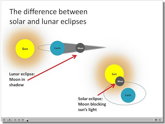
As a case in point, take a second to review this screen capture. What do you think might be the biggest factor confusing the learner?
A. Captions are embedded in the diagrams.
B. The representations of the earth, moon and sun should be photographs, not art.
C. The celestial bodies are not to scale.
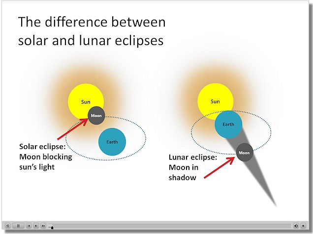
D. The two representations are not aligned to facilitate comparison.
Still, the original graphic gets a lot right.
The captions and labels are embedded in the graphic, making it easy to quickly identify what is what. The arrows are on the diagonal (more dynamic than a straight horizontal line). They are a high-contrast “pop” color so they effectively draw the eye’s attention. And they are also parallel, so they don’t add an “every which way” messiness that overloads the learner’s mental processing.
The colors of the sun, moon, and earth graphics easily reflect how we think about these celestial bodies when in eclipse—the moon either as black against the sun in a solar eclipse or as dark, in shadow, during lunar eclipse. In other words, the colors don’t make us have to rethink or register what is being represented.
When learning is the point, little things, such as crisp layout and alignment, matter.
RESOURCES
Rankin, R.O. (1989) Educational Technological Research and Development 37, 25-46.