ATD Blog
5 Instructional Design Tips to Create Modern Multi-Device Learning Content
Thu Apr 16 2015

Content
Content
The e-learning or digital content ecosystem is quickly evolving, and mobile learning, multi-device content, mobile responsive content (call it what you will) is here to stay. The problem, however, is that it’s not easy to stuff all the content you can onto a mobile screen. (Do you hear that subject matter experts?)
The e-learning or digital content ecosystem is quickly evolving, and mobile learning, multi-device content, mobile responsive content (call it what you will) is here to stay. The problem, however, is that it’s not easy to stuff all the content you can onto a mobile screen. (Do you hear that subject matter experts?)
Content
Consequently, the design process required for mobile of delivery is forcing developers into the “less is more” paradigm. For the last two years, I’ve been part of team focused on developing modern multi-device learning content. Here’s summary of our top five lessons for instructional designers.
Consequently, the design process required for mobile of delivery is forcing developers into the “less is more” paradigm. For the last two years, I’ve been part of team focused on developing modern multi-device learning content. Here’s summary of our top five lessons for instructional designers.
Content
#1: Define What “Mobile” Means to You—and Your Clients
#1: Define What “Mobile” Means to You—and Your Clients
Content
Mobile learning can be defined as many different types of learning experiences. Is it a dedicated app that makes good use of the mobile device features, such as DuoLingo for learning a specific skill? Is it using your phone or tablet to find things on Google? Is it e-learning content squeezed down to fit on a smaller screen? Or is it multiple versions of e-learning content, with some content ‘switched’ off to make better use of the mobile device’s real estate?
Mobile learning can be defined as many different types of learning experiences. Is it a dedicated app that makes good use of the mobile device features, such as DuoLingo for learning a specific skill? Is it using your phone or tablet to find things on Google? Is it e-learning content squeezed down to fit on a smaller screen? Or is it multiple versions of e-learning content, with some content ‘switched’ off to make better use of the mobile device’s real estate?
Content
In reality, mobile learning is all of these and more. I can tell you now, though, that if you define mobile learning as content squeezed down to fit a mobile device, you’ll find it hard to engage your learners.
In reality, mobile learning is all of these and more. I can tell you now, though, that if you define mobile learning as content squeezed down to fit a mobile device, you’ll find it hard to engage your learners.
Content
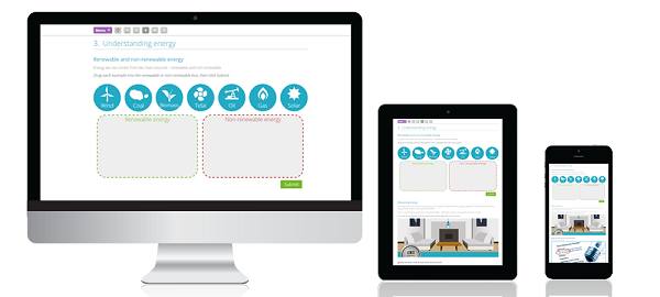
Technically, mobile responsive content means that content will adjust how it displays, depending on the size of the screen. See Figure 1 for an example of an e-learning course on sustainability delivered on a range of devices: desktop pc, iPad mini, and iPhone.
Technically, mobile responsive content means that content will adjust how it displays, depending on the size of the screen. See Figure 1 for an example of an e-learning course on sustainability delivered on a range of devices: desktop pc, iPad mini, and iPhone.
Content
Figure 1: Example of Multi-Device Course
Figure 1: Example of Multi-Device Course
Content
#2: Decide on a Minimum Device Set
#2: Decide on a Minimum Device Set
Content
Once you are clear on what mobile learning and mobile responsive mean to you, you are in a better position to decide on a minimum device set. Why is this important? For us, it helped distinct between apps, which were designed to make use of a specific mobile device’s features, and content that would work on a range of devices.
Once you are clear on what mobile learning and mobile responsive mean to you, you are in a better position to decide on a minimum device set. Why is this important? For us, it helped distinct between apps, which were designed to make use of a specific mobile device’s features, and content that would work on a range of devices.
Content
Of course, the client just wanted content to work on their devices. When we surveyed clients, the device set we found was:
Of course, the client just wanted content to work on their devices. When we surveyed clients, the device set we found was:
Content
tablets – Android and iOS, with iPad mini as the minimum size
tablets – Android and iOS, with iPad mini as the minimum size
Content
phones – Android and iOS with iPhone 5 as the minimum size.
phones – Android and iOS with iPhone 5 as the minimum size.
Content
The point: it is important not to try to be all things to all people. We focused on the medium-sized device, and decided not to design for anything smaller than the iPhone 5. We made this decision because that’s what our clients wanted, and we recognized that the smaller the screen, the bigger the cognitive load on the learner. Also, keep in mind that if you design a specific app, then you design for a specific type of mobile learning experience that may require a specific set of design skills.
The point: it is important not to try to be all things to all people. We focused on the medium-sized device, and decided not to design for anything smaller than the iPhone 5. We made this decision because that’s what our clients wanted, and we recognized that the smaller the screen, the bigger the cognitive load on the learner. Also, keep in mind that if you design a specific app, then you design for a specific type of mobile learning experience that may require a specific set of design skills.
Content
#3: Understand Your New Design Parameters
#3: Understand Your New Design Parameters
Content
The good news: It’s finally time to say goodbye to fixed screen, click-next, sleep-inducing e-learning content! The even better news: Instructional designers have the opportunity to learn new visual design skills.
The good news: It’s finally time to say goodbye to fixed screen, click-next, sleep-inducing e-learning content! The even better news: Instructional designers have the opportunity to learn new visual design skills.
Content
If your content has to work across multiple devices, as an instructional designer, you have to move from a fixed-size screen to a more fluid, scrolling format. In fact, this new world of multi-device content is more akin to web page or print design than our previous fixed screen approach.
If your content has to work across multiple devices, as an instructional designer, you have to move from a fixed-size screen to a more fluid, scrolling format. In fact, this new world of multi-device content is more akin to web page or print design than our previous fixed screen approach.
Content
What can designers do? Embrace scrolling screens. It is also important for designers to think about each page layout and “visual hooks.” As a multi-device instructional designer, you’ll find yourself more heavily involved with the visual design aspects of the content than you were previously. Each content page is now a blank canvass on which you paint your learning concepts.
What can designers do? Embrace scrolling screens. It is also important for designers to think about each page layout and “visual hooks.” As a multi-device instructional designer, you’ll find yourself more heavily involved with the visual design aspects of the content than you were previously. Each content page is now a blank canvass on which you paint your learning concepts.
Content
If you want to increase your visual skill for the new multi-device world, look at magazine and newspaper layouts. Look at how they use space, color, images, and other visual elements to tie related stories together. Here are some additional tips:
If you want to increase your visual skill for the new multi-device world, look at magazine and newspaper layouts. Look at how they use space, color, images, and other visual elements to tie related stories together. Here are some additional tips:
Content
Design for the minimum device size first. Think about how text, images, and interactions will feel like to the user on a small device.
Design for the minimum device size first. Think about how text, images, and interactions will feel like to the user on a small device.
Content
Be prudent with audio and video. Will clients be able to listen to audio and watch video on their devices?
Be prudent with audio and video. Will clients be able to listen to audio and watch video on their devices?
Content
Tie related concepts together on one page as pages can be of different lengths.
Tie related concepts together on one page as pages can be of different lengths.
Content
Use visual headings, similar images, and color coding to help reinforce related concepts.
Use visual headings, similar images, and color coding to help reinforce related concepts.
Content
Make more use of follow-up resources. Focus your screen content on conveying core information first, and then provide follow-up checklists, flowcharts, consolidation, and so forth via another medium. We know that learning isn’t just a one-off event, so let’s use our devices accordingly.
Make more use of follow-up resources. Focus your screen content on conveying core information first, and then provide follow-up checklists, flowcharts, consolidation, and so forth via another medium. We know that learning isn’t just a one-off event, so let’s use our devices accordingly.
Content
#4: Adjust Your Storyboarding Process
#4: Adjust Your Storyboarding Process
Content
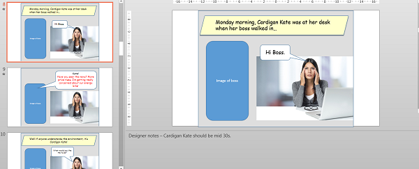
If you’ve been an instructional designer as long as I have, you’ll have experimented with different types of storyboarding. For me, Microsoft PowerPoint works the best.
If you’ve been an instructional designer as long as I have, you’ll have experimented with different types of storyboarding. For me, Microsoft PowerPoint works the best.
Content
A sample process may look like this: Set up a PowerPoint template, which includes the page name and section name, along with the type of page and interaction template. This allows instructional designers and clients to better visualize the flow of content, which is probably the biggest adjustment for designers. PowerPoint slides are also easy to edit for clients who wish to make storyboard additions or modifications.
A sample process may look like this: Set up a PowerPoint template, which includes the page name and section name, along with the type of page and interaction template. This allows instructional designers and clients to better visualize the flow of content, which is probably the biggest adjustment for designers. PowerPoint slides are also easy to edit for clients who wish to make storyboard additions or modifications.
Content
Figure 2: Storyboard Example
Figure 2: Storyboard Example
Content
#5: Integrate Scrolling into the Design Process
#5: Integrate Scrolling into the Design Process
Content
If you are not careful, your instructional designers will simply transfer their fixed screen design ideas into long scrolling pages. What do I mean by that?
If you are not careful, your instructional designers will simply transfer their fixed screen design ideas into long scrolling pages. What do I mean by that?
Content
Instead of three “click-next screens,” they will stuff three section/mini pages into one long scrolling screen. That is okay for a few pages, but you’ll miss out on making the best use of the scrolling real estate. It also doesn’t consider how users interact with mobile devices. Tactile interactions—touch screen, swipe, and transitions—are more characteristic of mobile content than old style, click-next e-learning.
Instead of three “click-next screens,” they will stuff three section/mini pages into one long scrolling screen. That is okay for a few pages, but you’ll miss out on making the best use of the scrolling real estate. It also doesn’t consider how users interact with mobile devices. Tactile interactions—touch screen, swipe, and transitions—are more characteristic of mobile content than old style, click-next e-learning.
Content
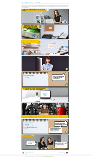
Figure 3 offers an example we can examine. Cardigan Kate is a key persona in the sustainability e-learning course. She is the internal energy efficiency champion, and is working to positively influence some of her less-than-interested colleagues such as Busy Barney, Put It Off Pete, Skeptic Sue, and Don’t Care Danny.
Figure 3 offers an example we can examine. Cardigan Kate is a key persona in the sustainability e-learning course. She is the internal energy efficiency champion, and is working to positively influence some of her less-than-interested colleagues such as Busy Barney, Put It Off Pete, Skeptic Sue, and Don’t Care Danny.
Content
The page layout is a long scrolling design, stepping the learner through Kate’s discovery of the reasons behind everyone’s barriers to becoming more energy efficient. This works better than splitting the story over several pages as it gives visual continuity and re-enforcement of the overall learning concept. (You can try the interaction for yourself here .)
The page layout is a long scrolling design, stepping the learner through Kate’s discovery of the reasons behind everyone’s barriers to becoming more energy efficient. This works better than splitting the story over several pages as it gives visual continuity and re-enforcement of the overall learning concept. (You can try the interaction for yourself here.)
Content
Figure 3: Scrolling Example
Figure 3: Scrolling Example
Content
**
**
Content
**
**
Content
Moving Forward
Moving Forward
Content
Bottom line: Let’s embrace this new multi-device world—and up our game to incorporate the best of what other digital content designers are already doing!
Bottom line: Let’s embrace this new multi-device world—and up our game to incorporate the best of what other digital content designers are already doing!
Content
For more tips, sign up for the ATD Learning Technology Community newsletter.
For more tips, sign up for the ATD Learning Technology Community newsletter.