ATD Blog
5 Ways to Improve the Design of Your PowerPoint Training Decks
Tue Sep 14 2021

Content
Whether you’re an accidental instructional designer or the person tasked with creating learning materials for your department, you’re likely using PowerPoint to create your learning.
Whether you’re an accidental instructional designer or the person tasked with creating learning materials for your department, you’re likely using PowerPoint to create your learning.
Content
Even if your content is solid, you may feel that you could stand to improve your design skills. The good news is that PowerPoint is right at your fingertips. It’s a robust design tool that can help you create some amazing graphics. This post outlines five easy-to-use tips that you can start using right away.
Even if your content is solid, you may feel that you could stand to improve your design skills. The good news is that PowerPoint is right at your fingertips. It’s a robust design tool that can help you create some amazing graphics. This post outlines five easy-to-use tips that you can start using right away.
Tip 1: Find a Color Palette
Content
The first thing you can do today to improve your PowerPoint training decks is to choose a simple color palette and stick to it. You may have free reign to choose your colors, or your company may have brand standards that tie your hands. Either way, it’s best to decide on your color palette in advance and use it throughout your training deck.
The first thing you can do today to improve your PowerPoint training decks is to choose a simple color palette and stick to it. You may have free reign to choose your colors, or your company may have brand standards that tie your hands. Either way, it’s best to decide on your color palette in advance and use it throughout your training deck.
Content
Why this works. A color palette ties your entire design together. It allows your learner to focus on your content instead of being distracted by how it looks.
Why this works. A color palette ties your entire design together. It allows your learner to focus on your content instead of being distracted by how it looks.
Content
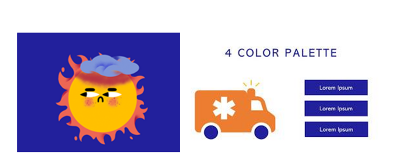
If you choose the color palette, then you can find an image with a color scheme that you like and pull the colors from that design. As an example, this design uses an image from designer Elena Resko in blue, yellow, orange, and white.
If you choose the color palette, then you can find an image with a color scheme that you like and pull the colors from that design. As an example, this design uses an image from designer Elena Resko in blue, yellow, orange, and white.
Tip 2: Simplify Your Color Palette
Content
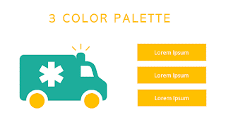
Even if you find design inspiration, it may have too many colors for an effective design. For best results, you should try to select two to four colors and use them throughout your training deck.
Even if you find design inspiration, it may have too many colors for an effective design. For best results, you should try to select two to four colors and use them throughout your training deck.
Content
Why this works . A simple color palette is easier to manage well if you’re newer to graphic design.
Why this works. A simple color palette is easier to manage well if you’re newer to graphic design.
Content
As a base, choose a darker color and a lighter color from your color palette source. If you want to find another color, try finding one for contrast (usually white or black).
As a base, choose a darker color and a lighter color from your color palette source. If you want to find another color, try finding one for contrast (usually white or black).
Tip 3: Remember: Black Doesn’t Always Go With Everything
Content
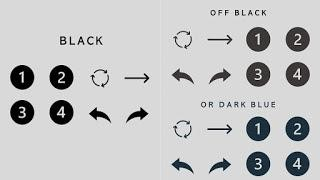
Black is considered a basic color for text and other content, but it’s not always the best option. Instead of using black, many designers use another dark color that creates less contrast.
Black is considered a basic color for text and other content, but it’s not always the best option. Instead of using black, many designers use another dark color that creates less contrast.
Content
Why this works . Depending on the color scheme, black may be too harsh of a color for text, whereas an off-black may be just right.
Why this works. Depending on the color scheme, black may be too harsh of a color for text, whereas an off-black may be just right.
Content
Off-black, brown-black, or dark blue could be just what you need when paired with pastels, which are considered color tints (colors with white added to them). As an example, see the image below.
Off-black, brown-black, or dark blue could be just what you need when paired with pastels, which are considered color tints (colors with white added to them). As an example, see the image below.
Tip 4: Skip the Outlines
Content
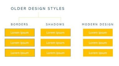
To keep up with modern design trends and give your training decks a clean design, eliminate outlines around boxes. This can seem counterintuitive because PowerPoint immediately applies an outline to your shape whenever you insert a box on a slide.
To keep up with modern design trends and give your training decks a clean design, eliminate outlines around boxes. This can seem counterintuitive because PowerPoint immediately applies an outline to your shape whenever you insert a box on a slide.
Content
Why this works . Flat design (design without shadows and outlines) has dominated apps and other web-based content for the past few years. Your learners are familiar with this design style, so imitating it will produce a design aesthetic that feels current.
Why this works. Flat design (design without shadows and outlines) has dominated apps and other web-based content for the past few years. Your learners are familiar with this design style, so imitating it will produce a design aesthetic that feels current.
Tip 5: Use the Built-In PowerPoint Icon Set
Content
PowerPoint has improved the quality of its built-in icons. There are no bean people or tacky human outlines. What you’ll find now are modern, sophisticated designs in two formats. Each icon comes in a heavyweight/dark theme and a lightweight/light theme.
PowerPoint has improved the quality of its built-in icons. There are no bean people or tacky human outlines. What you’ll find now are modern, sophisticated designs in two formats. Each icon comes in a heavyweight/dark theme and a lightweight/light theme.
Content
Why this works . Instead of scouring the internet for matching icon sets, you can save time (and probably money) by using the built-in icons. As a bonus, you can avoid finding the perfect free icon, only to realize it has a watermark that you’ll have to pay to remove.
Why this works. Instead of scouring the internet for matching icon sets, you can save time (and probably money) by using the built-in icons. As a bonus, you can avoid finding the perfect free icon, only to realize it has a watermark that you’ll have to pay to remove.
Content
To take full advantage of these icons, decide whether you will use the dark theme or light theme. For best results, choose the theme that coordinates best with the weight of the other designs in your deck.
To take full advantage of these icons, decide whether you will use the dark theme or light theme. For best results, choose the theme that coordinates best with the weight of the other designs in your deck.
Content
Pro tip. Look through the icon sets and ensure you have every item you need before beginning your build. You should be able to find a full set of the basic icons you’ll need for most designs, but check early in your project just to make sure you won’t have to look elsewhere.
Pro tip. Look through the icon sets and ensure you have every item you need before beginning your build. You should be able to find a full set of the basic icons you’ll need for most designs, but check early in your project just to make sure you won’t have to look elsewhere.
Content
You don't have to be an expert designer to boost the look and feel of your PowerPoint training decks. Even if you're new to creating training materials, use the five tips below:
You don't have to be an expert designer to boost the look and feel of your PowerPoint training decks. Even if you're new to creating training materials, use the five tips below:
Content
Find a color palette.
Find a color palette.
Content
Simplify your color palette.
Simplify your color palette.
Content
Remember: black doesn’t always go with everything.
Remember: black doesn’t always go with everything.
Content
Skip the outlines.
Skip the outlines.
Content
Use the built-in PowerPoint icon set.
Use the built-in PowerPoint icon set.