ATD Blog
A Picture on Every Page: The Dangerous Lure of Stock Art
Mon Aug 20 2012

Content
Quick.
Quick.
Content
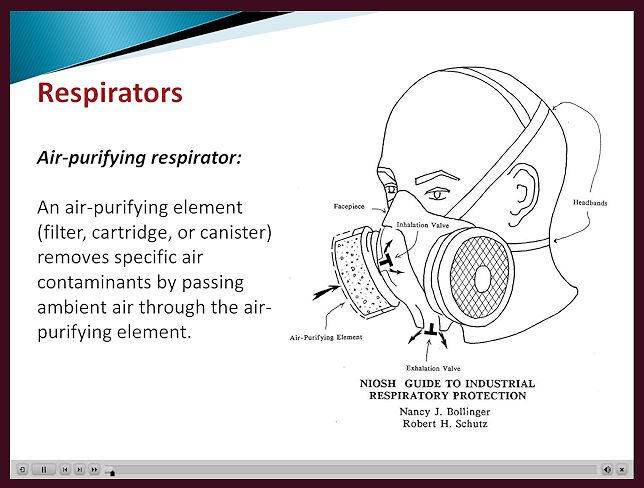
What’s your reaction to graphics in training that look, slide after slide, like these?
What’s your reaction to graphics in training that look, slide after slide, like these?
Content
Perhaps you think, “Not great, maybe mediocre. The text is sort of bunched up in the same relative position, and there’s a static placement for graphics. But overall, the graphics are not too terrible. They are quality stock art, don’t overpower, and are topically related to the content.”
Perhaps you think, “Not great, maybe mediocre. The text is sort of bunched up in the same relative position, and there’s a static placement for graphics. But overall, the graphics are not too terrible. They are quality stock art, don’t overpower, and are topically related to the content.”
Content
So what’s the harm in what one artist calls “pouring the pretty on” to keep interest up and make the slides more attractive as long as one doesn’t cross the line into seductive graphics which depress learning (Harp and Mayer, 1998)? Here are three:
So what’s the harm in what one artist calls “pouring the pretty on” to keep interest up and make the slides more attractive as long as one doesn’t cross the line into seductive graphics which depress learning (Harp and Mayer, 1998)? Here are three:
Content
Desensitizing the learner to the importance of the graphic : When graphics are always appear in the same location, the learner can start skimming over them. If suddenly you insert a critical concept graphic in the sequence, you have already trained the learner to ignore it.
Desensitizing the learner to the importance of the graphic: When graphics are always appear in the same location, the learner can start skimming over them. If suddenly you insert a critical concept graphic in the sequence, you have already trained the learner to ignore it.
Content
Missing opportunities : Templates aid development, but it’s easy to let templates drive the instructional design, luring us into the “three bullet points and a picture” routine. Once trapped, we sometimes forget to employ “think time” and consider a graphic that can actually do the work of instruction by visually interpreting a key concept.
Missing opportunities: Templates aid development, but it’s easy to let templates drive the instructional design, luring us into the “three bullet points and a picture” routine. Once trapped, we sometimes forget to employ “think time” and consider a graphic that can actually do the work of instruction by visually interpreting a key concept.
Content
Overlooking the power of format and layout : We even neglect to use the simple power of text and white space to:
Overlooking the power of format and layout: We even neglect to use the simple power of text and white space to:
Content
Manage the learners’ cognitive load by breaking information down into visually manageable chunks
Manage the learners’ cognitive load by breaking information down into visually manageable chunks
Content
Show organizational relationships by alignment, indentation, bolding, underlining or other tools for emphasis
Show organizational relationships by alignment, indentation, bolding, underlining or other tools for emphasis
Content
Direct attention with white space, color or simple cues
Direct attention with white space, color or simple cues
Content
So how do we make sure we don’t fall into the rut? Here are five simple guidelines for breaking the addiction to stock art:
So how do we make sure we don’t fall into the rut? Here are five simple guidelines for breaking the addiction to stock art:
Content
Justify every graphic. Ask yourself, “Does it do anything to further instruction, such as explain a key concept, organize the content, or visualize quantitative data? If it doesn’t, can I replace it with one that does?”
Justify every graphic. Ask yourself, “Does it do anything to further instruction, such as explain a key concept, organize the content, or visualize quantitative data? If it doesn’t, can I replace it with one that does?”
Content
Provide clear direction to the production team on instructional purpose for the photos or art. Don’t abdicate art selection or layout to anyone who doesn’t understand the content or your design.
Provide clear direction to the production team on instructional purpose for the photos or art. Don’t abdicate art selection or layout to anyone who doesn’t understand the content or your design.
Content
Use white space and text attributes such as size, font, color, and alignment to direct attention, demonstrate organization, and manage cognitive load in the layout.
Use white space and text attributes such as size, font, color, and alignment to direct attention, demonstrate organization, and manage cognitive load in the layout.
Content
Rethink template designs that relegate all graphics to the same “off to the side” space.
Rethink template designs that relegate all graphics to the same “off to the side” space.
Content
Invest in some basic texts such as The Non-Designer’s Design Book by Robin Williams, Editing by Design by Jan White or either of Stephen Kosslyn’s Graph Design for the Mind and Eye or his practical handbook Clear and to the Point.
Invest in some basic texts such as The Non-Designer’s Design Book by Robin Williams, Editing by Design by Jan White or either of Stephen Kosslyn’s Graph Design for the Mind and Eye or his practical handbook Clear and to the Point.
Content
The bottom line? Incorporate steps in your design process that encourage you to use effective graphics. Mitigate those steps that make your graphics predictable, boring and ignored
The bottom line? Incorporate steps in your design process that encourage you to use effective graphics. Mitigate those steps that make your graphics predictable, boring and ignored