ATD Blog
Design Makeover: Using Dynamic Lines and Color Contrast to Direct Attention
Fri Nov 01 2013

Content
Are simple slide or webpage layout choices undermining your instructional purpose? Here’s an example slide similar to one from a client. The slide is an advanced organizer for the different phases of the process and is repeated at beginning of each phase.
Are simple slide or webpage layout choices undermining your instructional purpose? Here’s an example slide similar to one from a client. The slide is an advanced organizer for the different phases of the process and is repeated at beginning of each phase.

Content
After reviewing the slide, consider which of the following design elements you think actively depress learning by adding unnecessary mental load:
After reviewing the slide, consider which of the following design elements you think actively depress learning by adding unnecessary mental load:
Content
percentage of white space
percentage of white space
Content
high contrast color
high contrast color
Content
curve\\diagonal line
curve\\diagonal line
Content
text on left, graphic on right
text on left, graphic on right
Content
consistent color of text
consistent color of text
Content
decorative graphic
decorative graphic
Content
sightline (or direction character is “looking”).
sightline (or direction character is “looking”).
Content
Of course, you selected items 2, 3, 5, and 7. You probably noted that the powers of the diagonal line, the high contrast red color, and consistent color of text list are actually working against the instructional purpose of this slide.
Of course, you selected items 2, 3, 5, and 7. You probably noted that the powers of the diagonal line, the high contrast red color, and consistent color of text list are actually working against the instructional purpose of this slide.
Content
For starters, the high contrast red (2) used in the curving, diagonal line (3) most certainly directs attention, but in this example, together they direct it away from the content. There is a school of design thought based on Gestalt philosophy that names this tendency the “principal of continuance,” which states that once we start looking in a direction, we keep following that direction until something stops us. The same principle is at work as we follow the sightline of the onscreen character (7) to see where it is looking. Unfortunately, it’s away from where we want the learners to focus.
For starters, the high contrast red (2) used in the curving, diagonal line (3) most certainly directs attention, but in this example, together they direct it away from the content. There is a school of design thought based on Gestalt philosophy that names this tendency the “principal of continuance,” which states that once we start looking in a direction, we keep following that direction until something stops us. The same principle is at work as we follow the sightline of the onscreen character (7) to see where it is looking. Unfortunately, it’s away from where we want the learners to focus.
Content
Also, the consistency of color (5) in the text misses an opportunity to quickly alert the learners to where they are in the training. Because there is no navigational cueing, the learners are forced to use a little more mental processing to orient themselves.
Also, the consistency of color (5) in the text misses an opportunity to quickly alert the learners to where they are in the training. Because there is no navigational cueing, the learners are forced to use a little more mental processing to orient themselves.
Content
Here’s where color could be used to reduce cognitive load and cue learners to “where they are, where they’ve been, and where they can go.” According to Jakob Nielsen in Designing Web Usability : the Practice of Simplicity, this is the backbone of all interface design.
Here’s where color could be used to reduce cognitive load and cue learners to “where they are, where they’ve been, and where they can go.” According to Jakob Nielsen in Designing Web Usability: the Practice of Simplicity, this is the backbone of all interface design.
Content
Design elements that aid instructional design
Design elements that aid instructional design
Content
Understanding just a few graphic design principles can help instructional designers avoid using graphics in such a way as to unintentionally undermine learning content. Here are a few elements that can help improve the example slide:
Understanding just a few graphic design principles can help instructional designers avoid using graphics in such a way as to unintentionally undermine learning content. Here are a few elements that can help improve the example slide:
Content
Contrasts in shape or color help to draw the eye.
Contrasts in shape or color help to draw the eye.
Content
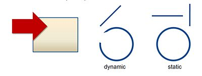
Open circles and diagonal lines are more dynamic (and thus more engaging) because they almost demand that the viewer follow the line. whereas static lines (horizontal or vertical) and closed circles keep the viewer’s eye put.
Open circles and diagonal lines are more dynamic (and thus more engaging) because they almost demand that the viewer follow the line. whereas static lines (horizontal or vertical) and closed circles keep the viewer’s eye put.
Content
People follow sight-lines, in part because it’s in our built-in survival mechanisms. We’re herd animals; if one of the pack notices something potentially dangerous, the rest look at it as well. To illustrate this principle, stand on a street corner and look up at the sky, then notice how many others do the same.
People follow sight-lines, in part because it’s in our built-in survival mechanisms. We’re herd animals; if one of the pack notices something potentially dangerous, the rest look at it as well. To illustrate this principle, stand on a street corner and look up at the sky, then notice how many others do the same.
Content
Using these three principles, let’s take a look at how we can revise the original layout to better support the learners’ quick and effective comprehension, helping them reserve their mental juices for processing the instructional content.
Using these three principles, let’s take a look at how we can revise the original layout to better support the learners’ quick and effective comprehension, helping them reserve their mental juices for processing the instructional content.

Content
In this revision, the eye is still drawn to the red colored scroll, but now it points back to the list. That red is pretty eye-catching, but at least now we’ve made it work a little more for us. By rotating the orientation, the “character” now also reinforces the new focus, by “looking” in toward the content.
In this revision, the eye is still drawn to the red colored scroll, but now it points back to the list. That red is pretty eye-catching, but at least now we’ve made it work a little more for us. By rotating the orientation, the “character” now also reinforces the new focus, by “looking” in toward the content.
Content
More important, by introducing color cueing techniques to break up the list, the “Where am I?” is now easily spotted. These simple changes do yeoman’s work. No explanation is required, and little extra cognitive load is needed. Most computer literate folks will know immediately that two topics have been covered, the topic or phase we are “on,” and the few other issues that remain to be discussed.
More important, by introducing color cueing techniques to break up the list, the “Where am I?” is now easily spotted. These simple changes do yeoman’s work. No explanation is required, and little extra cognitive load is needed. Most computer literate folks will know immediately that two topics have been covered, the topic or phase we are “on,” and the few other issues that remain to be discussed.
Content
One of early Gestalt philosophers, Kurt Koffka, is credited with qualifying Aristotle’s phrase “the whole is greater than the sum of its parts” to be “the whole is other than the sum of its parts." As designers responsible for creating instructional materials, it is important to see how all the elements come together to create meaning.
One of early Gestalt philosophers, Kurt Koffka, is credited with qualifying Aristotle’s phrase “the whole is greater than the sum of its parts” to be “the whole is other than the sum of its parts." As designers responsible for creating instructional materials, it is important to see how all the elements come together to create meaning.
View Courses Recommended for You