ATD Blog
Infographics for Complex Learning Content
Wed Dec 21 2016

Content
Complex learning content does not require complex infographics. Clear, easy-to-follow language improves understanding, recollection, and agreement. The same is true for educational infographics. The KISS—Keep It Simple Silly—rule applies to all forms of communication.
Complex learning content does not require complex infographics. Clear, easy-to-follow language improves understanding, recollection, and agreement. The same is true for educational infographics. The KISS—Keep It Simple Silly—rule applies to all forms of communication.
Content
However, there are times when illustrating complexity is necessary. For example, you may want to show that the approach is complex and, therefore, requires focus to complete.
However, there are times when illustrating complexity is necessary. For example, you may want to show that the approach is complex and, therefore, requires focus to complete.
Content
A complex solution does not need to be confusing. Confusing infographics lower adoption rates. Albert Einstein was right when he said, “If you can’t explain it simply, you don’t understand it well enough.” The secret is to summarize your learning content into one, concise message, such as in a headline or takeaway.
A complex solution does not need to be confusing. Confusing infographics lower adoption rates. Albert Einstein was right when he said, “If you can’t explain it simply, you don’t understand it well enough.” The secret is to summarize your learning content into one, concise message, such as in a headline or takeaway.
Content
Because the confused mind says no, a complex graphic must quickly and clearly communicate the main point (the message). It is our job as talent developers to help the learners understand, recall, and adopt our content.
Because the confused mind says no, a complex graphic must quickly and clearly communicate the main point (the message). It is our job as talent developers to help the learners understand, recall, and adopt our content.
Content
Here are three methods I use when making a complex, successful infographic:
Here are three methods I use when making a complex, successful infographic:
Content
Get to the point.
Get to the point.
Content
Chunk it.
Chunk it.
Content
Connect the dots.
Connect the dots.
Get to the Point
Content
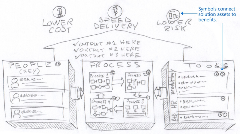
The main point should be obvious. Your main point is a one-sentence message. For example, if the main message is that applying this approach saves money, speeds delivery, and lowers risk, the graphic should clearly show this. It must be evident to the reviewer. Never bury the main point. Highlight it through aesthetic choices such as size, style, color, and positioning. The message is the basis for the infographic’s title.
The main point should be obvious. Your main point is a one-sentence message. For example, if the main message is that applying this approach saves money, speeds delivery, and lowers risk, the graphic should clearly show this. It must be evident to the reviewer. Never bury the main point. Highlight it through aesthetic choices such as size, style, color, and positioning. The message is the basis for the infographic’s title.
Chunk It
Content
Chunking breaks complex content into bite-size, digestible morsels. Group and label similar elements to avoid confusion. For example, arrange your approach into a timeline. Drawing a box around that which is similar chunks those activities, clarifies when they occur, and makes the content more approachable.
Chunking breaks complex content into bite-size, digestible morsels. Group and label similar elements to avoid confusion. For example, arrange your approach into a timeline. Drawing a box around that which is similar chunks those activities, clarifies when they occur, and makes the content more approachable.
Connect the Dots
Content
Prove to learners that they will achieve their goals by connecting the content to the promised outcomes. For example, use icons to flag elements that are most responsible for delivering the results, such as saving money, speedy delivery, or lowering risk.
Prove to learners that they will achieve their goals by connecting the content to the promised outcomes. For example, use icons to flag elements that are most responsible for delivering the results, such as saving money, speedy delivery, or lowering risk.
Content
The following sketch is an example that uses my three methods.
The following sketch is an example that uses my three methods.
Content
Clear, compelling communication is a critical success factor in all learning. The three methods—get to the point, chunk it, and connect the dots—work together to improve communication quality and your adoption rate.
Clear, compelling communication is a critical success factor in all learning. The three methods—get to the point, chunk it, and connect the dots—work together to improve communication quality and your adoption rate.