ATD Blog
Never Make a Slide Like This
Wed Jan 24 2018

Content
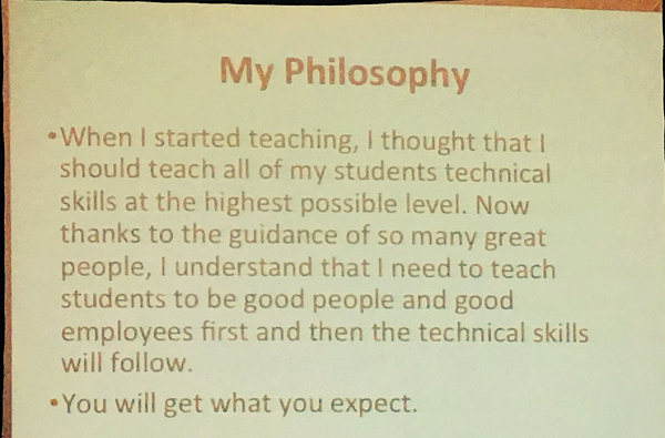
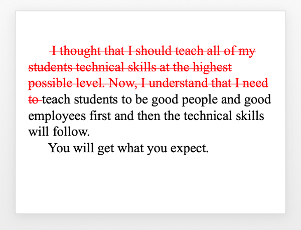
The slide shown below came up on my Twitter feed. I’m sure the intent was to share what the tweeter thought was a great idea.
The slide shown below came up on my Twitter feed. I’m sure the intent was to share what the tweeter thought was a great idea.
Content
What jumped out at me wasn’t the idea but that the slide needed some major work. Too harsh? Maybe. The presenter is a well-meaning person with a great idea to share. But this slide is not good. There is no nice way to say it.
What jumped out at me wasn’t the idea but that the slide needed some major work. Too harsh? Maybe. The presenter is a well-meaning person with a great idea to share. But this slide is not good. There is no nice way to say it.
Content
Here are the mistakes this presenter made—so you can avoid them in your next presentation.
Here are the mistakes this presenter made—so you can avoid them in your next presentation.
Content
(Backstory: Craig Cegielski shared this during a session at the 2017 MREA Annual Conference. You can see his presentation here , if you’re interested. I also want to note that not all of the slides are bad, which just illustrates that everyone can use a little editing sometimes.)
(Backstory: Craig Cegielski shared this during a session at the 2017 MREA Annual Conference. You can see his presentation here, if you’re interested. I also want to note that not all of the slides are bad, which just illustrates that everyone can use a little editing sometimes.)
Don’t Always Use Bullet Points
Content
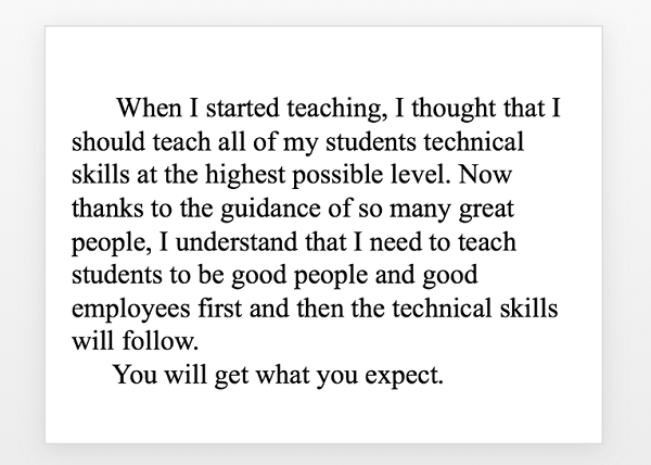
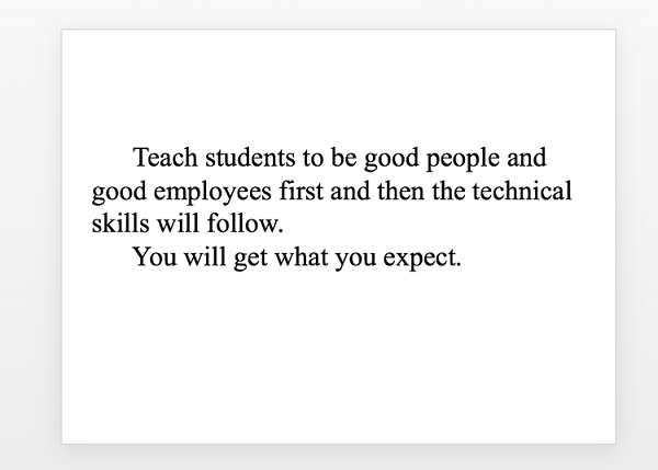
Why bullet points? They are totally unnecessary. There is no law that says all slides must have bullet points! This is a paragraph. If you want to show the first paragraph of a book you intend to write, then make this slide:
Why bullet points? They are totally unnecessary. There is no law that says all slides must have bullet points! This is a paragraph. If you want to show the first paragraph of a book you intend to write, then make this slide:
Content
In no way was the slide improved because of the bullets points. Likewise, in no way is it diminished because the bullet points have been removed.
In no way was the slide improved because of the bullets points. Likewise, in no way is it diminished because the bullet points have been removed.
Don’t Just Read at Your Audience
Content
Why are you there? If every word is on a slide, you are unnecessary. You made yourself redundant. Write an article and hand it out. If, for some reason, you want your article in PowerPoint form, make slides like this one and send us the PowerPoint. No one wants to sit in a room and have presenters read at them. We know how to read. Plus, it is difficult to read text while listening. If you want the audience to read your article, be quiet and let them read without distraction.
Why are you there? If every word is on a slide, you are unnecessary. You made yourself redundant. Write an article and hand it out. If, for some reason, you want your article in PowerPoint form, make slides like this one and send us the PowerPoint. No one wants to sit in a room and have presenters read at them. We know how to read. Plus, it is difficult to read text while listening. If you want the audience to read your article, be quiet and let them read without distraction.
Content
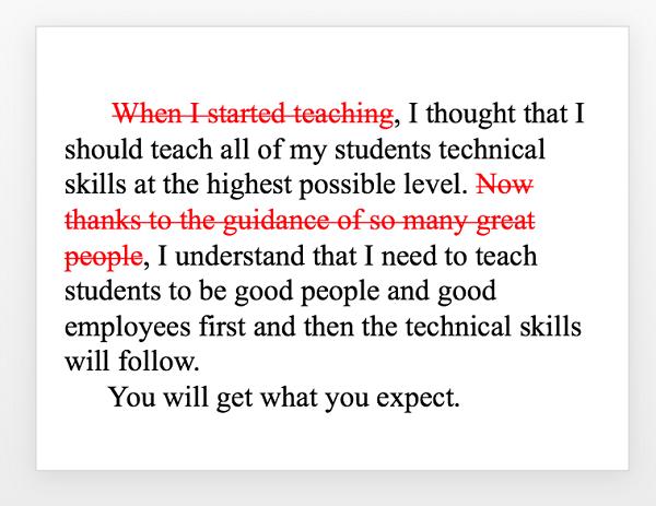
But let’s say you want to visually present key points. If that’s the case, you don’t need fluff and filler. You need key words. You are there to speak. You can embellish as you talk. Look at the fluff on the slide:
But let’s say you want to visually present key points. If that’s the case, you don’t need fluff and filler. You need key words. You are there to speak. You can embellish as you talk. Look at the fluff on the slide:
Content
Cut the fat. Make it easier on the audience.
Cut the fat. Make it easier on the audience.
Don’t Have Too Many Words on a Slide
Content
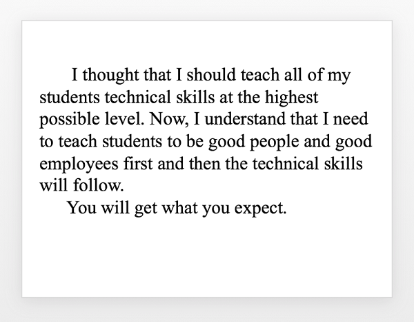
Where did we get the idea that people come to presentations to read? Shouldn’t presentations be about presenting? About oral communication? Many people have made this point and fought to change the wordy, bullet-point mindset, yet the message hasn’t caught on. The core message ofour example slide is still buried in unnecessary words.
Where did we get the idea that people come to presentations to read? Shouldn’t presentations be about presenting? About oral communication? Many people have made this point and fought to change the wordy, bullet-point mindset, yet the message hasn’t caught on. The core message ofour example slide is still buried in unnecessary words.
Content
Isn’t this the message attendees are supposed to get? Isn’t this the essence of the slide?
Isn’t this the message attendees are supposed to get? Isn’t this the essence of the slide?
Content
We are making progress. No bullet points, a lot less fat, easier to read. But why should reading being involved at all?
We are making progress. No bullet points, a lot less fat, easier to read. But why should reading being involved at all?
Don’t Have Complete Sentences on a Slide
Content
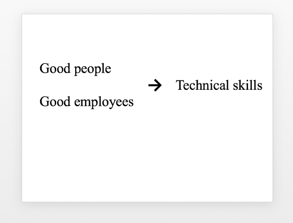
Key words only! You are there for a reason. You are there to present, to talk, to explain. Don’t have slides doing your job.
Key words only! You are there for a reason. You are there to present, to talk, to explain. Don’t have slides doing your job.
Content
Six words. Easy to see, easy to remember. And it conveys the essence of the message in the slide we that began with. The presenter will fill in the rest. If you were giving this presentation, orally add the story about how you came to believe this. Orally add the details about what to teach first, Orally explain how technical skills follow if the first parts are taught.
Six words. Easy to see, easy to remember. And it conveys the essence of the message in the slide we that began with. The presenter will fill in the rest. If you were giving this presentation, orally add the story about how you came to believe this. Orally add the details about what to teach first, Orally explain how technical skills follow if the first parts are taught.
Content
In other words, be a presenter, not a reading supervisor.
In other words, be a presenter, not a reading supervisor.
Content
For more advice, check out Own Any Occasion . This book offers 11 steps for how to craft the perfect message and captivate audiences with exceptional delivery, no matter the circumstance.
For more advice, check out Own Any Occasion. This book offers 11 steps for how to craft the perfect message and captivate audiences with exceptional delivery, no matter the circumstance.