ATD Blog
Picture Books
Thu Sep 28 2006
Content
Crammer and Wasiak's Change the Way You See Everything is about "Asset-Based Thinking" -- increasing your focus on what is right, rather than what is wrong (deficit-based thinking). The book starts off with the premise that our brains are hard wired for DBT that makes us concentrate on personal gaps and weaknesses rather than our strengths.
Crammer and Wasiak's Change the Way You See Everything is about "Asset-Based Thinking" -- increasing your focus on what is right, rather than what is wrong (deficit-based thinking). The book starts off with the premise that our brains are hard wired for DBT that makes us concentrate on personal gaps and weaknesses rather than our strengths.
Content
However, while the words have changed, it is basically what Donald Clifton writes about in Soar with Your Strengths .
However, while the words have changed, it is basically what Donald Clifton writes about in Soar with Your Strengths.
Content
While neither book does much to back up their point with any evidence as they lack any real research, the Parable of the Rabbit, from Clifton's book, is perhaps the most interesting part of the two books and more than likely all you need to read to understand what both authors are driving at.
While neither book does much to back up their point with any evidence as they lack any real research, the Parable of the Rabbit, from Clifton's book, is perhaps the most interesting part of the two books and more than likely all you need to read to understand what both authors are driving at.
Content
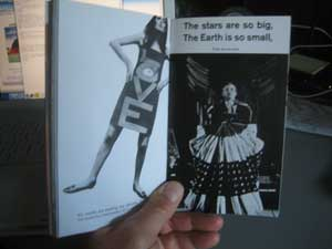
However, the real point of the post is the way Crammer and Wasiak's book is designed -- pictures fill up the pages just as much as the text, if not more. While I like a good picture to help understand or reinforce the text, it seems that Change the Way You See Everything goes beyond this. While beautiful to look at, it seems, well, quite gimmicky. Many of the photos do nothing to help understand the book.
However, the real point of the post is the way Crammer and Wasiak's book is designed -- pictures fill up the pages just as much as the text, if not more. While I like a good picture to help understand or reinforce the text, it seems that Change the Way You See Everything goes beyond this. While beautiful to look at, it seems, well, quite gimmicky. Many of the photos do nothing to help understand the book.

Content
Change the Way You See Everything
Change the Way You See Everything
Content
Perhaps the one book that pulled this off successfully was McLuhan's The Medium is the Massage , who uses pictures to create a montage demonstrating the effects of the media.
Perhaps the one book that pulled this off successfully was McLuhan's The Medium is the Massage, who uses pictures to create a montage demonstrating the effects of the media.
Content
The Medium is the Massage
The Medium is the Massage
Content
This typographic experimentation by authors can be quite good at times, such as Rick Moody's The Diviners . While the book was only so-so, the author blocked out a page of text to depict a page read by a character that has itself been blocked out, leaving only the words "such" and "thirst."
This typographic experimentation by authors can be quite good at times, such as Rick Moody's The Diviners. While the book was only so-so, the author blocked out a page of text to depict a page read by a character that has itself been blocked out, leaving only the words "such" and "thirst."
Content
The Diviners
The Diviners
Content
If the visual carries the same narrative weight as the text itself, then it often becomes superfluous, and if it replaces the text, then it almost seems to become a shorthand for language itself. Yet if the author is successful with the visual, then it works in parallel with the text to promote understanding. As a learning designer, how do you know when to use a visual? And when do you know to stop before it comes to the point of being gimmicky?
If the visual carries the same narrative weight as the text itself, then it often becomes superfluous, and if it replaces the text, then it almost seems to become a shorthand for language itself. Yet if the author is successful with the visual, then it works in parallel with the text to promote understanding. As a learning designer, how do you know when to use a visual? And when do you know to stop before it comes to the point of being gimmicky?