ATD Blog
Responsive Design and Geolocation Move the Industry Forward
Fri May 23 2014


Other than the introduction of HTML5 output, responsive design and geolocation are the first truly new features in the big five authoring tools in years. Sure, each of the tools (Captivate, Camtasia, Storyline, Studio, and Lectora) have had features that were new to them, but not many were features that were new to the collective toolset.
Responsive design and geolocation in Adobe Captivate 8 move the industry forward and take a few steps in helping e-learning authoring tools catch up to the rest of the web world.
Responsive design
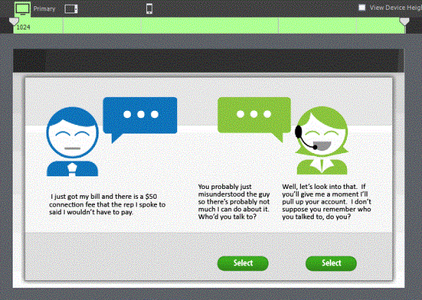
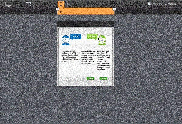
In Adobe Captivate 8, you can choose to create a responsive project instead of a regular project. When you do, you get three layouts that automatically adjust the size and position of the elements based on the size of the layout. You can manually override the layout by excluding elements for each layout or manually moving or reformatting objects.
I’ll be honest. The responsive features don’t work quite like I imagined. But that’s not necessarily a bad thing.
The advantage: Many other responsive tools (web and e-learning) are very template-driven. While they move us forward in terms of mobile device compatibility, they set us backwards in terms of flexible and engaging slide design. I’ve taken demos of some responsive e-learning tools that remind me of layout limits I saw in early rapid development tools back in 2003.
But Adobe Captivate 8 isn’t template-based. Instead, it lets you fully design different versions of the same slide.
The disadvantage: While some of the redesign is done for you, it seems like there’s a fair amount of manual work involved. Plus, you may struggle to get all the same information to fit on the smaller screen.
There’s an easy feature that lets you remove information on the smaller screen layouts, but you don’t have the option of collapsing the information for the learner to expand (like you do in many of the template-based tools).
Think Amazon. When you look at a book’s listing on your computer, you see all the details. When you look at the same listing on your phone, you see the most important details at the top and then headings for the other information. You can click on any of the headings to get more detail. This creates a less cluttered screen for the phone user while still providing all (or at least most) of the information.
In Adobe Captivate 8, the information architecture does not change from layout to layout. You can remove elements you don’t want on the smaller layout, but it doesn’t create an expand/collapse hierarchy of heading and detail.
What does this mean for e-learning designers? It means you can continue to design screen layouts freely without be limited by templates, but it’s going to take some extra time to make the formatting adjustments on each of the layouts to make all the information fit.
Geolocation
In Adobe Captivate 8, you can create if/then action that pair up the learner’s location with location variables you create. For example, you can localize a course by showing certain information if the learner is taking the course is in the New York office and other information if the student is in the Boston office.
A system variable keeps track of the student’s current location, assuming the student is on a GPS-enabled device. And you can create user variables with the target latitude, longitude, and an accuracy threshold. With those variables in place, you can create if/then actions based on the student’s location.
Moving forward
I’m hoping to find a project in the near future where I can use some of these great new features in a real-world context. What applications do you see for these new features?
