ATD Blog
The Responsiveness Myth
Thu May 11 2017

Not too long ago, I helped a client create testing procedures to evaluate several learning management system (LMS) suppliers. One issue that intrigued them was whether multiple devices could access these courses. Without exploring all the implications of this scenario, the simple answer is “Yes.” A better question is, “Should all web-based training be on every device?” Before answering this question, you need to understand what is meant by responsive and adaptive design.
Responsive design refers to a design that works no matter the screen size. Regardless of the size of the screen, the same layout automatically responds to that size.
Adaptive design means creating distinct layouts for multiple screen sizes. The device accessing the material determines the layout used. For example, there could be a specific layout for phones, tablets, and desktop computers.
During my client’s LMS search, they acquired the term responsive and became obsessed with it as a requirement for LMS selection. They loved the idea of viewing all their courses on all their devices. During the testing, some of the testers dwelled on the fact that even if the course displayed correctly in landscape mode, sometimes it was cropped in portrait mode. “Rotate your device!” I wanted to shout—and may have. After all, if I picked up a book upside-down, I would not expect it to reorient to my perspective. I would turn it over. More important though, a responsive design is great for e-books and websites because you can easily design them on a grid with columns and free-flowing text. Think InDesign and linking text from frame-to-frame. Each frame can have a unique shape, and the text adjusts to it.
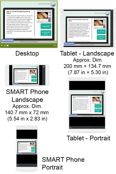
Unfortunately, this is not the case with web-based training. There can be images, buttons, panes, text, videos, and so on contained in the course. These do not always lend themselves well to a responsive design. Figure 1 shows a course designed for a PC as it responds to different devices and orientations. In each case, the course responds correctly, but the smaller the device gets, the smaller the detail on the screen. You have a beautifully responsive course that no one over the age of 20 can see. And even the 20-year-olds, along with the rest of us, will need to repeatedly pinch and zoom to see the material and interact with it. This is both impractical and annoying.
In this age of the Internet of Things, shouldn’t you be able to access your material on anything and anywhere? It depends on your expectations. If you do not mind the elements becoming more difficult to see as the device gets smaller, then you are good to go.
If the course must work on all devices, be easy to view, and require only one design, then you must design for the smallest device. The drawback is that if you design for a phone, the amount of content that fits this screen without causing eyestrain will look like you produced it for preschoolers on a larger device.
Rather than obsessing over responsiveness, analyze your audience and the type of content you are presenting. A course that requires viewing detailed images, lots of text, and takes more than 10 minutes to complete is better on a larger device. Microlearning of 10 minutes or less, simple quizzes, flashcard-type interactions, and data you would want on demand lend themselves better to small devices. Consider your materials, your audience, and your objectives, then design for the most appropriate device. If you must have the same course on all your devices, then use adaptive design.