ATD Blog
5 Easy Ways to Add Delight to Your E-Learning
Wed Mar 20 2019

Content
I'm sitting at my desk, a cup of coffee at my side, working on feedback pop-ups for a quiz. I type the word “ Impressive! ” on the screen, then turn to my colleagues in the room and announce, "I really enjoy writing personalized feedback!"
I'm sitting at my desk, a cup of coffee at my side, working on feedback pop-ups for a quiz. I type the word “Impressive!” on the screen, then turn to my colleagues in the room and announce, "I really enjoy writing personalized feedback!"
Content
Indeed, one of my favorite parts of designing e-learning is to picture what our users will experience—all the delightful little additions add up to create a great experience.
Indeed, one of my favorite parts of designing e-learning is to picture what our users will experience—all the delightful little additions add up to create a great experience.
Content
Creating delightful experiences doesn't need to add hours to a project. It also shouldn't be the star of the show. Adding delight to an e-learning project is about enhancing the experience. It's about keeping people interested while not distracting them from what they need to know or do. It may even be something that helps drive behavior.
Creating delightful experiences doesn't need to add hours to a project. It also shouldn't be the star of the show. Adding delight to an e-learning project is about enhancing the experience. It's about keeping people interested while not distracting them from what they need to know or do. It may even be something that helps drive behavior.
Content
Here are five times I like to enhance my e-learning projects.
Here are five times I like to enhance my e-learning projects.
1. When You Want to Get Learners’ Attention
Content
Use micro-interactions. What's a micro-interaction? An article on UX design explains that "Micro-interactions are events that have one main task—a single purpose—and they’re found all over your device and within apps. Their purpose is to delight the user; to create a moment that is engaging, welcoming and, dare we say it—human."
Use micro-interactions. What's a micro-interaction? An article on UX design explains that "Micro-interactions are events that have one main task—a single purpose—and they’re found all over your device and within apps. Their purpose is to delight the user; to create a moment that is engaging, welcoming and, dare we say it—human."
Content
The use of micro-interactions will draw the focus of the user to a particular area or action they need to take. Micro-interactions should be intentional, be engaging, add something to the project, and not distract from the goal. One of my favorite micro-interactions comes from The Sill , a site where you can buy plants and garden supplies: When you place an item in your cart, a leaf falls.
The use of micro-interactions will draw the focus of the user to a particular area or action they need to take. Micro-interactions should be intentional, be engaging, add something to the project, and not distract from the goal. One of my favorite micro-interactions comes from The Sill, a site where you can buy plants and garden supplies: When you place an item in your cart, a leaf falls.
Content
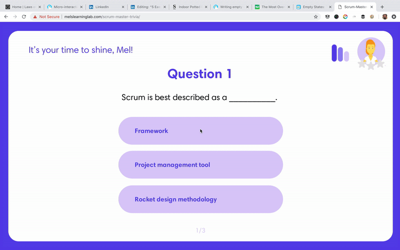
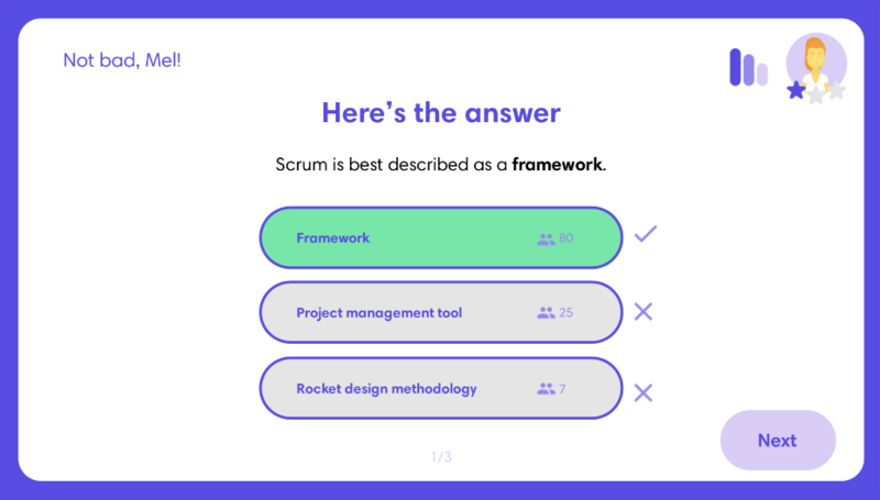
I use micro-interactions in several of my portfolio examples. In Scrum Master Trivia (see below), when you earn a star, it grows and fills in the star placeholders.
I use micro-interactions in several of my portfolio examples. In Scrum Master Trivia (see below), when you earn a star, it grows and fills in the star placeholders.
Content
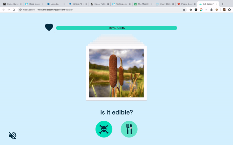
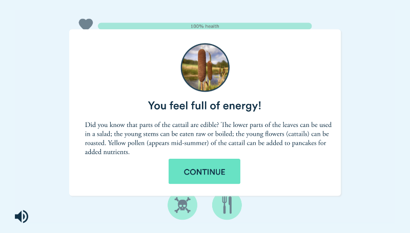
Another example is in the Is It Edible? activity. The cards slide to the left or the right depending on which answer you select, and the heart on the health meter bursts to indicate whether you answered the question right or wrong.
Another example is in the Is It Edible? activity. The cards slide to the left or the right depending on which answer you select, and the heart on the health meter bursts to indicate whether you answered the question right or wrong.
2. When There's Nothing to See
Content
Empty states are a huge missed opportunity for delightful moments in e-learning courses. According to a TechCrunch article , an empty state is "what the user sees when there is no data to display on the screen. This could be because: The user has only just signed up. The user has cleared the data themselves. There’s been an error."
Empty states are a huge missed opportunity for delightful moments in e-learning courses. According to a TechCrunch article, an empty state is "what the user sees when there is no data to display on the screen. This could be because: The user has only just signed up. The user has cleared the data themselves. There’s been an error."
Content
One place you may have noticed an empty state is your email box. Most email services have a friendly image in place of your email when you do not have any email.
One place you may have noticed an empty state is your email box. Most email services have a friendly image in place of your email when you do not have any email.
Content
A great use for filling in an empty state would be in a collection area. Instead of leaving the collection area blank, try adding a witty message indicating they have no items. Another use for empty states would be to fill in something before a user needs to do something.
A great use for filling in an empty state would be in a collection area. Instead of leaving the collection area blank, try adding a witty message indicating they have no items. Another use for empty states would be to fill in something before a user needs to do something.
Content
For more ideas and empty state examples, check out http://emptystat.es .
For more ideas and empty state examples, check out http://emptystat.es.
3. While Learners Are Waiting
Content
Loaders let your users know something is going to happen while keeping their interest. You can add subtle delight by using customized loading icons when users are waiting. Unfortunately, many courses have plain, cookie-cutter loading icons. Jazz up your loading icons with an icon related to the course, your logo, tips, or fun facts.
Loaders let your users know something is going to happen while keeping their interest. You can add subtle delight by using customized loading icons when users are waiting. Unfortunately, many courses have plain, cookie-cutter loading icons. Jazz up your loading icons with an icon related to the course, your logo, tips, or fun facts.
Content
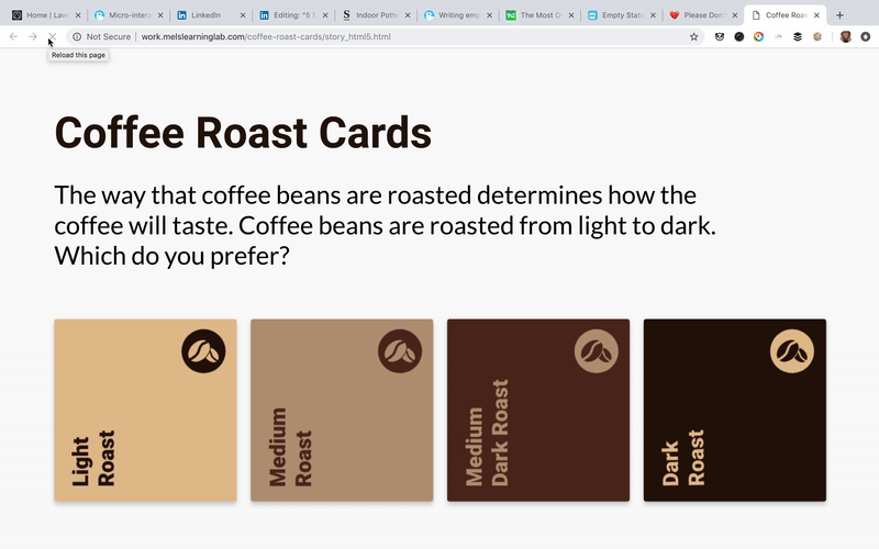
For example, in my Coffee Cards example (see below), I use a coffee bean as the loader for the desktop version of the course. If you’re not sure where to start, I use loading.io to create animated loading icons.
For example, in my Coffee Cards example (see below), I use a coffee bean as the loader for the desktop version of the course. If you’re not sure where to start, I use loading.io to create animated loading icons.
4. Setting Tone Throughout a Course
Content
Over the past year, I have been working on writing in a more conversational tone. That doesn't mean you have to stick to a conversational tone in every course, but rather, choose where it will fit best. I generally apply a conversational tone when providing feedback, when welcoming the user, after completion of a task, or after specific actions.
Over the past year, I have been working on writing in a more conversational tone. That doesn't mean you have to stick to a conversational tone in every course, but rather, choose where it will fit best. I generally apply a conversational tone when providing feedback, when welcoming the user, after completion of a task, or after specific actions.
Content
Here are two examples where I use more of a conversational tone. In my Scrum Master Trivia game (see below), I give conversational feedback in the upper left corner. It's something most users did not notice because there is nothing that draws their eye to it.
Here are two examples where I use more of a conversational tone. In my Scrum Master Trivia game (see below), I give conversational feedback in the upper left corner. It's something most users did not notice because there is nothing that draws their eye to it.
Content
In the Is It Edible? example (see below), I pair a micro-interaction of the feedback card flying in with a conversational tone. The Is It Edible? example really draws the eye into the card and feedback.
In the Is It Edible? example (see below), I pair a micro-interaction of the feedback card flying in with a conversational tone. The Is It Edible? example really draws the eye into the card and feedback.
Content
When writing in a conversational tone, try to keep it short and snappy and related to a specific action or outcome.
When writing in a conversational tone, try to keep it short and snappy and related to a specific action or outcome.
5. When You Want to Connect Personally With Learners
Content
The least appealing thing to me as a user is to take a course that isn't relevant to me—and not just from a content standpoint. When I take an e-learning course, I like to see people who are like me represented in the materials. For example, I don't work in a suit-and-tie culture, so when I take a course where everyone's dressed up, it just doesn't resonate. In fact, I find that it distracts me from the content and doesn't feel personable.
The least appealing thing to me as a user is to take a course that isn't relevant to me—and not just from a content standpoint. When I take an e-learning course, I like to see people who are like me represented in the materials. For example, I don't work in a suit-and-tie culture, so when I take a course where everyone's dressed up, it just doesn't resonate. In fact, I find that it distracts me from the content and doesn't feel personable.
Content
Get to know your audience and their preferences regarding language, themes, imagery, and so forth. You want to use this as an opportunity to create a connection with your audience. That doesn't mean you have to perfectly please everyone. Sometimes less is more; if you're having difficulty on deciding if something should stay or go, it's probably best to do the latter.
Get to know your audience and their preferences regarding language, themes, imagery, and so forth. You want to use this as an opportunity to create a connection with your audience. That doesn't mean you have to perfectly please everyone. Sometimes less is more; if you're having difficulty on deciding if something should stay or go, it's probably best to do the latter.
Content
For more tips, join me at the ATD 2019 International Conference & Exposition. During my session, Changing the Face of UI Design for E-Learning , we will explore how to scale your e-learning design while focusing on creating exciting user experiences and designing effective learning content.
For more tips, join me at the ATD 2019 International Conference & Exposition. During my session, Changing the Face of UI Design for E-Learning, we will explore how to scale your e-learning design while focusing on creating exciting user experiences and designing effective learning content.
View Courses Recommended for You