ATD Blog
Infographics: A Quick Way to Clarify Learning Content
Wed Dec 05 2018

Content
Through visuals, you can improve the perceived professionalism of your presentation. Indeed, the correct visual choices help engage your audience consciously and unconsciously.
Through visuals, you can improve the perceived professionalism of your presentation. Indeed, the correct visual choices help engage your audience consciously and unconsciously.
Enter Infographics
Content
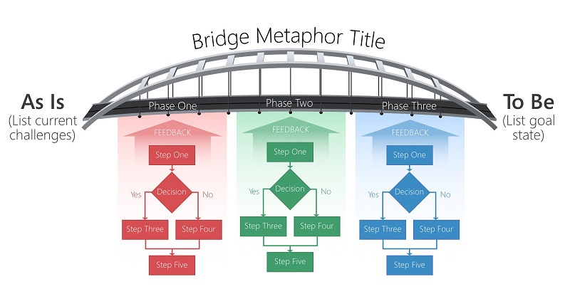
Informational graphics, or infographics, use any means (and graphic type) necessary to improve understanding. Infographics can include symbols, quantitative charts, and photographs; most use visual metaphors to communicate. For example, to explain transition, consider a bridge infographic. One side is the current situation, and the opposite side is the goal state (see figure below from A Trainer’s Guide to PowerPoint: Best Practices for Master Presenters ).
Informational graphics, or infographics, use any means (and graphic type) necessary to improve understanding. Infographics can include symbols, quantitative charts, and photographs; most use visual metaphors to communicate. For example, to explain transition, consider a bridge infographic. One side is the current situation, and the opposite side is the goal state (see figure below from A Trainer’s Guide to PowerPoint: Best Practices for Master Presenters).
Content
Figure 1. An Infographic Shows Transition With a Bridge Metaphor
Figure 1. An Infographic Shows Transition With a Bridge Metaphor
Content
Using a visual metaphor tells a brief story and contextualizes your content. In this case, the bridge metaphor intuitively communicates stability, connection, span, and other descriptors your learners associate with this image. A visual metaphor supports your messages consciously and unconsciously. (Use the graphic types in appendix A to select the best graphic to meet your needs.)
Using a visual metaphor tells a brief story and contextualizes your content. In this case, the bridge metaphor intuitively communicates stability, connection, span, and other descriptors your learners associate with this image. A visual metaphor supports your messages consciously and unconsciously. (Use the graphic types in appendix A to select the best graphic to meet your needs.)
Content
As with colors and fonts, the style of your infographic sends a message to your learner. For example, a layout with a simplified, clean aesthetic tells your audience that the content is modern 117 Render: Design Principles for Professional Slides and, perhaps, innovative. A traditional aesthetic communicates that your content is established and trusted. Style is another visual queue that engages your learner unconsciously.
As with colors and fonts, the style of your infographic sends a message to your learner. For example, a layout with a simplified, clean aesthetic tells your audience that the content is modern 117 Render: Design Principles for Professional Slides and, perhaps, innovative. A traditional aesthetic communicates that your content is established and trusted. Style is another visual queue that engages your learner unconsciously.
Content
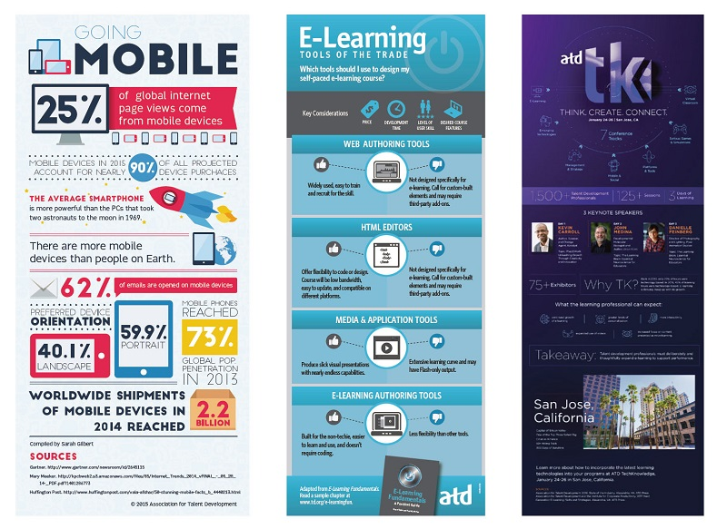
The styles of the three infographics in Figure 5-20 (from A Trainer’s Guide to PowerPoint Best Practices for Master Presenters ) convey different messages. For example, the left-most infographic uses large text, a relatively fun font, saturated colors, and a cartoon-like style. These choices make the content more approachable and appealing to certain audiences. Compare that with the center infographic, which uses a traditional font and icons with subdued, mostly monochromatic colors. As a result, it is perceived to be more academic. The third design’s aesthetic choices send yet another message to its target audience. Style plays a critical role in how you and your content are perceived.
The styles of the three infographics in Figure 5-20 (from A Trainer’s Guide to PowerPoint Best Practices for Master Presenters ) convey different messages. For example, the left-most infographic uses large text, a relatively fun font, saturated colors, and a cartoon-like style. These choices make the content more approachable and appealing to certain audiences. Compare that with the center infographic, which uses a traditional font and icons with subdued, mostly monochromatic colors. As a result, it is perceived to be more academic. The third design’s aesthetic choices send yet another message to its target audience. Style plays a critical role in how you and your content are perceived.
Content
Figure 2. Infographics Conveying Different Messages
Figure 2. Infographics Conveying Different Messages
Content
Want to learn more? Check out my book A Trainer’s Guide to PowerPoint Best Practices for Master Presenters , and be sure to join me February 4-5 at ATD TechKnowledge 2019 for the preconference Designing Visuals for Learning Certificate program. Taking this certificate course at an ATD conference ROCKS! Unlike standalone certificate classes, participants can attend related sessions that further increase their understanding of the materials, share what they learned with other attendees, and watch others present and see what works and what doesn't.
Want to learn more? Check out my book A Trainer’s Guide to PowerPoint Best Practices for Master Presenters, and be sure to join me February 4-5 at ATD TechKnowledge 2019 for the preconference Designing Visuals for Learning Certificate program. Taking this certificate course at an ATD conference ROCKS! Unlike standalone certificate classes, participants can attend related sessions that further increase their understanding of the materials, share what they learned with other attendees, and watch others present and see what works and what doesn't.