ATD Blog
Leveraging Principles of Art Theory for Visual Design
Mon Jan 04 2021

Content
You want your learners to buy into your training. You must convince learners that they need this information, and that their lives or careers will be better because of it.
You want your learners to buy into your training. You must convince learners that they need this information, and that their lives or careers will be better because of it.
Content
But here’s an uncomfortable truth: Your learners silently (if you’re lucky) evaluate the credibility of your work based on how it looks, and they do so with staggering speed. According to UX magazine, people tend to judge the quality of a product within just 50 milliseconds of looking at it .
But here’s an uncomfortable truth: Your learners silently (if you’re lucky) evaluate the credibility of your work based on how it looks, and they do so with staggering speed. According to UX magazine, people tend to judge the quality of a product within just 50 milliseconds of looking at it.
Content
Of course, a slick PowerPoint deck alone isn’t enough to achieve learning objectives; we know that the principles of instructional design are the foundation of our work. However, quality visual design helps learners appreciate, engage with, and understand your content. Form must meet function for the most effective learning outcomes.
Of course, a slick PowerPoint deck alone isn’t enough to achieve learning objectives; we know that the principles of instructional design are the foundation of our work. However, quality visual design helps learners appreciate, engage with, and understand your content. Form must meet function for the most effective learning outcomes.
Content
So, how do we create compelling visual designs, especially when we don’t have a background in art?
So, how do we create compelling visual designs, especially when we don’t have a background in art?
Content
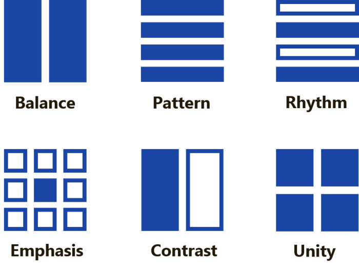
Start with the six principles of design: balance, pattern, rhythm, emphasis, contrast, and unity. Just as instructional design models and methodologies shape your training strategy, so should these principles shape your basic visual strategy. By applying them, you can create high-impact visuals. In addition, the principles provide you with more precise language to critique visual design when it’s presented to you.
Start with the six principles of design: balance, pattern, rhythm, emphasis, contrast, and unity. Just as instructional design models and methodologies shape your training strategy, so should these principles shape your basic visual strategy. By applying them, you can create high-impact visuals. In addition, the principles provide you with more precise language to critique visual design when it’s presented to you.
Content
The six principles of design are:
The six principles of design are:
Content
Balance: How visual elements are distributed in relation to an axis
Balance: How visual elements are distributed in relation to an axis
Content
Pattern: How visual elements repeat to create consistency
Pattern: How visual elements repeat to create consistency
Content
Rhythm: How visual elements repeat or alternate to create interest
Rhythm: How visual elements repeat or alternate to create interest
Content
Emphasis: How visual elements work together to create a focal point
Emphasis: How visual elements work together to create a focal point
Content
Contrast: How visual elements oppose each other to highlight differences
Contrast: How visual elements oppose each other to highlight differences
Content
Unity: How visual elements create an overall sense of cohesion
Unity: How visual elements create an overall sense of cohesion
Content
To understand how these principles are applied with maximum impact, look to the masters. Throughout history, the world’s greatest artists have used the six principles of design to captivate viewers.
To understand how these principles are applied with maximum impact, look to the masters. Throughout history, the world’s greatest artists have used the six principles of design to captivate viewers.
Content
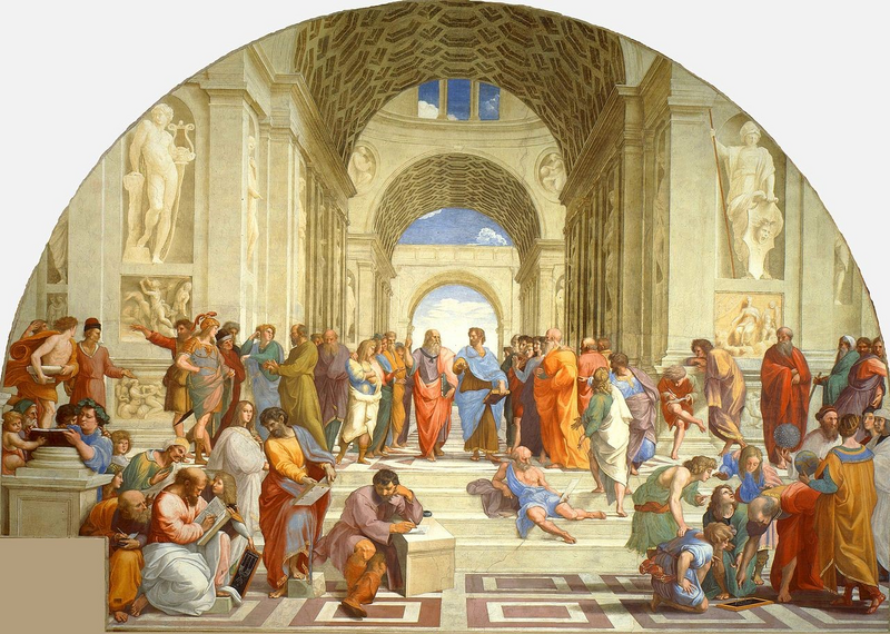
For example, take a look at "The School of Athens,” a fresco by Raphael.
For example, take a look at "The School of Athens,” a fresco by Raphael.
Content
Raffaello Sanzio da Urbino, The School of Athens , 1509–1511, fresco at the Raphael Rooms, Apostolic Palace, Vatican City. Public Domain image from Wikimedia Commons.
Raffaello Sanzio da Urbino, The School of Athens, 1509–1511, fresco at the Raphael Rooms, Apostolic Palace, Vatican City. Public Domain image from Wikimedia Commons.
Content
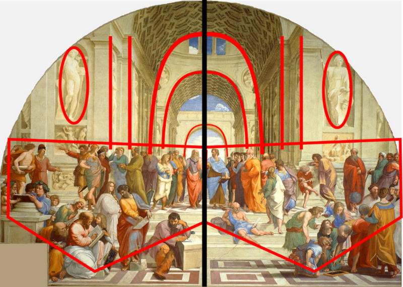
Here, Raphael uses the design principle of balance. Despite not being perfectly symmetrical, all the elements are arranged so that neither the left nor the right side of the work has dominance over the other. We see this when we highlight the major elements (red), in relation to a vertical axis (black):
Here, Raphael uses the design principle of balance. Despite not being perfectly symmetrical, all the elements are arranged so that neither the left nor the right side of the work has dominance over the other. We see this when we highlight the major elements (red), in relation to a vertical axis (black):
Content
On either side of the vertical axis, the arches present mirror images of each other, columns are evenly distributed, a marble sculpture appears near the outer edges, and the many figures in the bottom half of the work occupy roughly the same size and shape of space. Using balance, Raphael depicts a large number of elements with a wide variety of colors, shapes, and sizes, without seeming cluttered or disorderly.
On either side of the vertical axis, the arches present mirror images of each other, columns are evenly distributed, a marble sculpture appears near the outer edges, and the many figures in the bottom half of the work occupy roughly the same size and shape of space. Using balance, Raphael depicts a large number of elements with a wide variety of colors, shapes, and sizes, without seeming cluttered or disorderly.
Content
Now, here’s an example of how to translate this principle to visual design in a corporate setting.
Now, here’s an example of how to translate this principle to visual design in a corporate setting.
Content
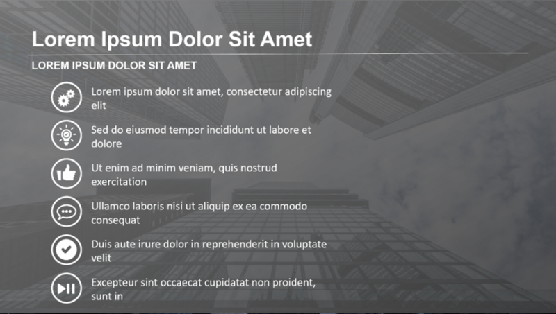
This slide exhibits poor balance in the main body section:
This slide exhibits poor balance in the main body section:
Content
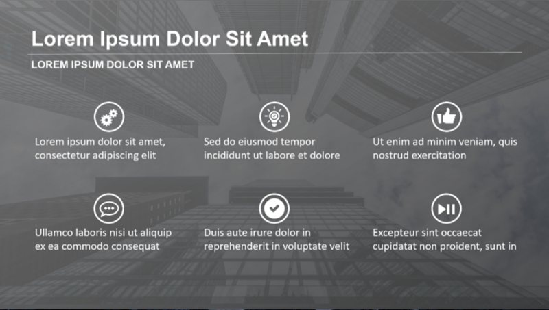
Using the same elements, the main body of the slide can be reconfigured to show balance according to a vertical axis:
Using the same elements, the main body of the slide can be reconfigured to show balance according to a vertical axis:
Content
But that’s just applying one design principle! Do you want to learn how to apply all six principles to your work, or how to give more precise feedback to your designers? Join me at ATD TechKnowledge 2021 for my session: “Leveraging Principles of Art Theory and History for Visual Design.”
But that’s just applying one design principle! Do you want to learn how to apply all six principles to your work, or how to give more precise feedback to your designers? Join me at ATD TechKnowledge 2021 for my session: “Leveraging Principles of Art Theory and History for Visual Design.”