ATD Blog
Taking on Visual Design When You Aren’t “Creative”
Wed Dec 19 2018

“I wish I could do visual design, but I’m just not very creative!”
I’ve heard so many variations of this statement from brilliant people who feel stumped when they need to handle visual design tasks. Ask them to design an organization-wide training strategy, code a new app, or facilitate a complex workshop, and they’re great. Ask them to create the visuals for a PowerPoint deck or e-learning screen, though, and doubt and discomfort come forward almost immediately.
And this is a huge challenge not just because it leads to work frustration, but because of two other factors as well.
First, it’s not uncommon for people in learning and development to be asked to take on more visual design tasks in our work, regardless of our design skills (or lack thereof). The rise of rapid development tools and apps as well as the continued presence of PowerPoint means that many of us technically have the means to create visual content, but not necessarily the skills to do it confidently or effectively.
Second, great visual design does more than make things “pretty.” It also has the power to make content easier for people to understand, remember, and actually use. That makes it a powerful tool for helping people learn, and not one we should brush off as just merely nice to have.
But what can you do when you buy in to the value of great visual design but just don’t see yourself as that creative? Well, part of the solution is realizing “creativity” doesn’t necessarily mean what you think it might.
People who don’t feel they’re creative will often back that statement up by saying how terrible they are at drawing or some other art-related skill. But it’s important to not confuse creativity with visual art skills. Sure, you might not have the ability to paint masterpieces or shoot award-winning films, but those are creative skills that people build over time, not creativity itself. Creativity is as simple as coming up with new ideas, new approaches, or new insights, and you likely do that all the time in your work.
So the challenge is less that people aren’t creative, and more that they don’t know how to use their creativity for visual design tasks. And that’s a much easier issue to overcome because the solution is simple: Identify some simple design techniques and then practice.
Here are three areas to start developing design skills that are easy to learn and will quickly make a noticeable impact on your work.
Reduce Details
Yes, the first visual design skill I recommend people work on building doesn’t even initially seem like a design skill at all. All you need to do is look for details that you can remove without losing the core information you need to share. This could mean closely analyzing your text to see if there are words, sentences, or even paragraphs that don’t add additional meaning; noticing you have multiple images on a screen and need only one to make your point; or checking to see if there are repeated details on a graph that you can scale back.
Removing unnecessary details instantly adds polish to your design because it makes things less cluttered. From a learning perspective, it helps your key points stand out more and can help avoid cognitive overload. As well, it helps buy you more area for the next design area to concentrate on: whitespace.

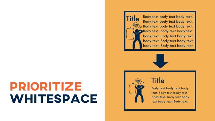
Prioritize Whitespace
Whitespace is simply the empty space in between design elements. It helps separate different items so the viewer can take them in individually, which is another factor that leads to less cognitive overload. It’s also easy to use—just be sure to leave space, essentially room to breathe, between the images, text, icons, and other visual aspects of your designs.
Whitespace is good from a design perspective, and it’s good from a learning perspective, too. That said, it’s often a weakness in designs for training and development. In the effort to give people as much information as possible (often in as few pages or screens as possible), you’ll sometimes see learning projects that are crammed with content, leaving little room for that helpful whitespace.
In most cases, though, you’re better off cutting content or adding more length to a project so you can ensure room for whitespace. There’s a surprisingly significant impact that something so deceptively simple can make in how people are able to view and understand the information you’re sharing—and it adds that visual design polish at the same time.
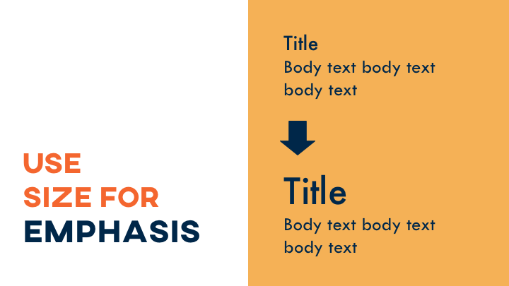
Use Size for Emphasis
Size is a useful tool for organizing content because people tend to view things that are larger as of more importance and vice versa. You can use that to your advantage to point out different kinds of content or purposefully draw people’s attention.
When you use size for visual organization, though, just remember to be consistent in your choices so people can see clear patterns and use that to help their understanding. For instance, if you make your title text in 24 point on one screen, use that same size throughout the project.
Even “creatives” need skills. By learning a few standard design skills and using a few pro techniques, you can make your designs look creative—even if you don’t think you are.
Want to learn more? Join me at ATD TechKnowledge 2019. During my session, Simple Strategies for Solving L&D Visual Design Challenges, we will explore how describing your project’s audience, context, simplicity, and flow can give you clues on how to improve your design.