ATD Blog
The Case for “Delight-enment”: UX in Learning Design
Wed Apr 11 2018

Content
Earlier this year, I spent 10 magical days in Morocco. Everywhere I turned was a feast for the senses: vibrant colors, tantalizing flavors, sumptuous views, and an exotic mélange of languages . . . none of which were my lingua franca.
Earlier this year, I spent 10 magical days in Morocco. Everywhere I turned was a feast for the senses: vibrant colors, tantalizing flavors, sumptuous views, and an exotic mélange of languages . . . none of which were my lingua franca.
Content
Undaunted (and motivated to order my own damn vin rouge thankyouverymuch), I turned to the language learning app Duolingo to resuscitate my single year of college French. Rolling through the stunning High Atlas Mountains toward the Sahara, I blasted through the lessons, charmed by the cartoonish characters, quick and effective feedback, amusing animations, and enticing lesson completion rewards (“lingots”).
Undaunted (and motivated to order my own damn vin rouge thankyouverymuch), I turned to the language learning app Duolingo to resuscitate my single year of college French. Rolling through the stunning High Atlas Mountains toward the Sahara, I blasted through the lessons, charmed by the cartoonish characters, quick and effective feedback, amusing animations, and enticing lesson completion rewards (“lingots”).
Content
While the app helped me solve my problem (learning French), the delightful user experience is what whet my appetite.
While the app helped me solve my problem (learning French), the delightful user experience is what whet my appetite.
Learning Effectiveness: Repetition or Delight?
Content
The 2017 Training Industry Report shows U.S. training expenditures rising to $90.6 billion in 2017. That’s a staggering amount invested in efforts to shift employee behaviors, change mindsets, and ultimately improve performance.
The 2017 Training Industry Report shows U.S. training expenditures rising to $90.6 billion in 2017. That’s a staggering amount invested in efforts to shift employee behaviors, change mindsets, and ultimately improve performance.
Content
When training is complete, learners have to face the formidable forgetting curve or sacrifice their newly acquired skills. Given the odds, wouldn’t it be cheaper and more reliable to simply engage them with lots of repetition? In my case, would I have been just as successful had I blown the dust off my French 101 flashcards instead of battling spotty Wi-Fi to access cool technology?
When training is complete, learners have to face the formidable forgetting curve or sacrifice their newly acquired skills. Given the odds, wouldn’t it be cheaper and more reliable to simply engage them with lots of repetition? In my case, would I have been just as successful had I blown the dust off my French 101 flashcards instead of battling spotty Wi-Fi to access cool technology?
Content
The short answer is non. While spaced repetition has been shown to decrease the forgetting curve, there’s another often-overlooked link between memorability and learning transfer: delight.
The short answer is non. While spaced repetition has been shown to decrease the forgetting curve, there’s another often-overlooked link between memorability and learning transfer: delight.
The Case for Delight
Content
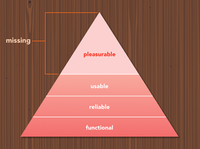
On the surface, delight may seem superfluous at best, silly at worst. After all, when we’re challenged as leaders to capture basic ROI measurement in our programs, why would we care beyond creating learning solutions that are simple, usable, and useful? The answer lies in a diagram of digital product design fundamentals that mirrors Maslow’s hierarchy :
On the surface, delight may seem superfluous at best, silly at worst. After all, when we’re challenged as leaders to capture basic ROI measurement in our programs, why would we care beyond creating learning solutions that are simple, usable, and useful? The answer lies in a diagram of digital product design fundamentals that mirrors Maslow’s hierarchy:
Content
In Designing for Emotion , Aaron Walter points out that fundamentals (functional, reliable, usable) have to be present in a digital product’s design before pleasure (or delight) can be layered in. The same is true in learning: We have to provide tools and solutions that address real problems in our learners’ lives (functional and useful). We need to create solutions that are consistently up and running (reliable), and they need to be effective and understandable (usable).
In Designing for Emotion, Aaron Walter points out that fundamentals (functional, reliable, usable) have to be present in a digital product’s design before pleasure (or delight) can be layered in. The same is true in learning: We have to provide tools and solutions that address real problems in our learners’ lives (functional and useful). We need to create solutions that are consistently up and running (reliable), and they need to be effective and understandable (usable).
Content
This is often where design stops, after meeting the primary learning or business needs and providing reasonable and reliable access to a tool. But think back on some of the, e-learning courses, and e-books we’re all (ahem) guilty of creating: It’s screen after screen of reading and clicking, reading and clicking. That type of learning is like a Wonder Bread and cheese product sandwich; it satisfies your hunger pretty easily and reliably, but it’s no match for a delightful masterpiece like the Sloppy Pig, a towering and delicious mess of pulled pork, cheddar cheese, and onion straws (and the country’s best BBQ sandwich ).
This is often where design stops, after meeting the primary learning or business needs and providing reasonable and reliable access to a tool. But think back on some of the, e-learning courses, and e-books we’re all (ahem) guilty of creating: It’s screen after screen of reading and clicking, reading and clicking. That type of learning is like a Wonder Bread and cheese product sandwich; it satisfies your hunger pretty easily and reliably, but it’s no match for a delightful masterpiece like the Sloppy Pig, a towering and delicious mess of pulled pork, cheddar cheese, and onion straws (and the country’s best BBQ sandwich).
Content
Delight is the icing on the cake, the thing that leaves a lasting impression and makes learners want what you’re serving up. It’s not as important as usability—and usability is not as important as usefulness. But Don Norman explains that when users are enjoying themselves, they’re more relaxed, and when the brain is relaxed, it functions better overall. Simply taking pleasure in the learning experience has an incredible ability to support fluid learning of new concepts, recalling past data, and acquiring skills.
Delight is the icing on the cake, the thing that leaves a lasting impression and makes learners want what you’re serving up. It’s not as important as usability—and usability is not as important as usefulness. But Don Norman explains that when users are enjoying themselves, they’re more relaxed, and when the brain is relaxed, it functions better overall. Simply taking pleasure in the learning experience has an incredible ability to support fluid learning of new concepts, recalling past data, and acquiring skills.
Content
Cognitive load, a term coined by educational psychologist John Sweller in the 1980s, represents the effort behind any series of tasks that users must put forth to process information. Images, text, sound, and haptic feedback all have the ability to either reduce or increase the user’s ability to process information. Decreasing the total amount of mental effort required for learners to complete tasks is a great goal for learning design in itself, but it’s also a place where delight can shine.
Cognitive load, a term coined by educational psychologist John Sweller in the 1980s, represents the effort behind any series of tasks that users must put forth to process information. Images, text, sound, and haptic feedback all have the ability to either reduce or increase the user’s ability to process information. Decreasing the total amount of mental effort required for learners to complete tasks is a great goal for learning design in itself, but it’s also a place where delight can shine.
Content
Using well-known design patterns (like search bars and common navigational elements) helps to decrease learners’ information processing and reduce cognitive load. But delightful extras, such as the Freddie High Five animation on MailChimp , go a step further: not only is it obvious how to finish sending out an email, but afterward, I get to high-five Freddie the MailChimp for a satisfying conclusion to the task. If I high-five him a bunch, his palm turns red and I’m redirected to their Fastfives game—the very definition of delight.
Using well-known design patterns (like search bars and common navigational elements) helps to decrease learners’ information processing and reduce cognitive load. But delightful extras, such as the Freddie High Five animation on MailChimp, go a step further: not only is it obvious how to finish sending out an email, but afterward, I get to high-five Freddie the MailChimp for a satisfying conclusion to the task. If I high-five him a bunch, his palm turns red and I’m redirected to their Fastfives game—the very definition of delight.
Creating Delight
Content
Creating delight begins with defining it. “ Surface delight ” is the colorful, frosted exterior of the experience design cupcake; it has the power to evoke a visceral response from the user. Think seamless user interfaces, interesting animations, appealing imagery, appropriate sound, and engaging microcopy (humor, slang, predicting users’ questions in advance, and so on).
Creating delight begins with defining it. “Surface delight” is the colorful, frosted exterior of the experience design cupcake; it has the power to evoke a visceral response from the user. Think seamless user interfaces, interesting animations, appealing imagery, appropriate sound, and engaging microcopy (humor, slang, predicting users’ questions in advance, and so on).
Content
Interactive content like video, quizzes, and games can also drive surface delight, as well as microinteractions (subtly moving icons such as the Facebook “like” thumb or an expanding shape like the Instagram heart). These little extras add visual fun, humanize technology-enabled experiences, and help users navigate, get feedback, and take action.
Interactive content like video, quizzes, and games can also drive surface delight, as well as microinteractions (subtly moving icons such as the Facebook “like” thumb or an expanding shape like the Instagram heart). These little extras add visual fun, humanize technology-enabled experiences, and help users navigate, get feedback, and take action.
Content
“ Deep delight ” is more holistic and happens on the lower levels of the pleasure pyramid (functional, reliable, usable). Deep delight happens only when users are completely immersed in an experience without distraction. When using a tool or solution is so frictionless, streamlined, and anticipatory of user needs that it works even better than the user expected, that experience evokes deep delight. While its ingredients are far less sexy than the beautifully decorated surface of the cupcake, without them, dessert isn’t even possible.
“Deep delight” is more holistic and happens on the lower levels of the pleasure pyramid (functional, reliable, usable). Deep delight happens only when users are completely immersed in an experience without distraction. When using a tool or solution is so frictionless, streamlined, and anticipatory of user needs that it works even better than the user expected, that experience evokes deep delight. While its ingredients are far less sexy than the beautifully decorated surface of the cupcake, without them, dessert isn’t even possible.
Content
Creating delightful moments isn’t the starting point for effective experience design, but it does make the end result of technology-supported learning experiences more fun, worthwhile, and effectual. Seek out delight, and you might find a missing ingredient to learning success. C'est magique!
Creating delightful moments isn’t the starting point for effective experience design, but it does make the end result of technology-supported learning experiences more fun, worthwhile, and effectual. Seek out delight, and you might find a missing ingredient to learning success. C'est magique!
Content
Want to learn more? Join me at the ATD 2018 International Conference & Exposition for the session: Designing the User Experience: 5 Things Learning Professionals Need to Know About UI and UX
Want to learn more? Join me at the ATD 2018 International Conference & Exposition for the session: Designing the User Experience: 5 Things Learning Professionals Need to Know About UI and UX