ATD Blog
The Graphic Truth About Graphs
Mon Jul 11 2016

Content
Content
As instructional designers, we know the power of helping our learners visualize data. Charts and graphs are perfect vehicles for doing so. However, we need to make sure we aren’t distorting the information in our efforts to clarify the key points and make them memorable.
As instructional designers, we know the power of helping our learners visualize data. Charts and graphs are perfect vehicles for doing so. However, we need to make sure we aren’t distorting the information in our efforts to clarify the key points and make them memorable.
Content
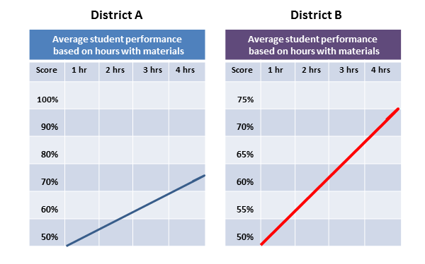
For example, a learner glancing at the two graphs below might think that District B’s scores increased dramatically, while District A’s scores increased modestly.
For example, a learner glancing at the two graphs below might think that District B’s scores increased dramatically, while District A’s scores increased modestly.
Content
Yet, the data represented in the two graphs is the same! The scores in District A and District B both went from an average of 50 percent to 75 percent when students were given more time with the materials.
Yet, the data represented in the two graphs is the same! The scores in District A and District B both went from an average of 50 percent to 75 percent when students were given more time with the materials.
Content
So what are the graphic conventions that make District B’s results appear so much better?
So what are the graphic conventions that make District B’s results appear so much better?
Content
The Y axis is subtly different. In the District B graph, the Y axis has smaller increments, which makes the “improvement” line steeper.
The Y axis is subtly different. In the District B graph, the Y axis has smaller increments, which makes the “improvement” line steeper.
Content
The trend line in District B’s graph is red. High contrast colors jump to the foreground, ensuring your eye is immediately drawn to them.
The trend line in District B’s graph is red. High contrast colors jump to the foreground, ensuring your eye is immediately drawn to them.
Content
The thicker weight of District B’s trend line makes it more dramatic than District A’s trend line.
The thicker weight of District B’s trend line makes it more dramatic than District A’s trend line.
Content
Diagonal lines are dynamic—they prompt the eye to follow the line. The steeper the climb, the greater the visual impact.
Diagonal lines are dynamic—they prompt the eye to follow the line. The steeper the climb, the greater the visual impact.
Content
The trend line in the District B graph is not only steeper, it’s also longer. This also suggests a greater gain.
The trend line in the District B graph is not only steeper, it’s also longer. This also suggests a greater gain.
Content
The color combination and relative position make the District B graph appear larger than the District A graph, even though they are exactly the same size. This gives greater emphasis and thus greater importance to the District B graph, reinforcing the impression that its results were superior and more dramatic.
The color combination and relative position make the District B graph appear larger than the District A graph, even though they are exactly the same size. This gives greater emphasis and thus greater importance to the District B graph, reinforcing the impression that its results were superior and more dramatic.
Content
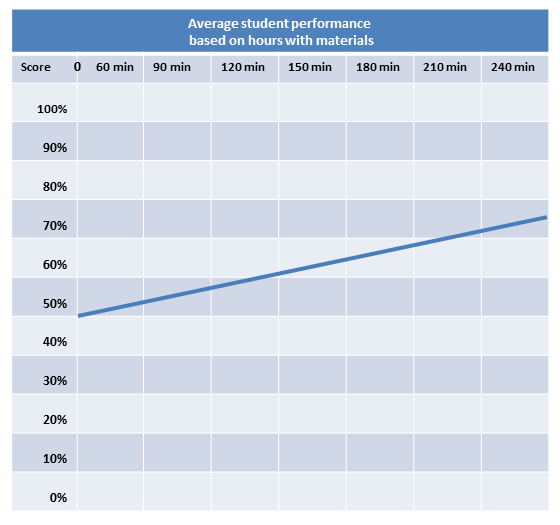
Let’s look at a different graph of the same data. This time the X and Y axes begin at "0" and there are more tick points on the X axis. Note that the trend line flattens considerably.
Let’s look at a different graph of the same data. This time the X and Y axes begin at "0" and there are more tick points on the X axis. Note that the trend line flattens considerably.
Content
So what does this mean to us as instructional designers? While we’d never deliberately manipulate graphs to prejudice our learners’ perception, we can gain some useful guidelines from these examples. Avoid unintentionally stacking the deck when creating graphs to illustrate comparisons. Even if you want to emphasize results (direct attention), simplify and eliminate chart noise (manage cognitive load), or make your point memorable (cue in long-term memory for easy retrieval), the visuals still need to be objective. Here are a few tips:
So what does this mean to us as instructional designers? While we’d never deliberately manipulate graphs to prejudice our learners’ perception, we can gain some useful guidelines from these examples. Avoid unintentionally stacking the deck when creating graphs to illustrate comparisons. Even if you want to emphasize results (direct attention), simplify and eliminate chart noise (manage cognitive load), or make your point memorable (cue in long-term memory for easy retrieval), the visuals still need to be objective. Here are a few tips:
Content
Make the scale objective. By starting at 50 percent, the improvement over time appears more dramatic in the first two graphs.
Make the scale objective. By starting at 50 percent, the improvement over time appears more dramatic in the first two graphs.
Content
Mind your Ys and Xs—make sure they are consistent.
Mind your Ys and Xs—make sure they are consistent.
Content
Pay attention to color emphasis and color combinations, especially when comparing multiple graphs. Red is a difficult color to use because it adds emphasis. Using the same color in different hues for showing gradations (think temperatures) can reinforce trends.
Pay attention to color emphasis and color combinations, especially when comparing multiple graphs. Red is a difficult color to use because it adds emphasis. Using the same color in different hues for showing gradations (think temperatures) can reinforce trends.
Content
Use an appropriate weight (thickness) for the trend lines, and use the same weight for charts with multiple lines.
Use an appropriate weight (thickness) for the trend lines, and use the same weight for charts with multiple lines.
Content
Avoid 3-D treatments because they can and often do distort the perception of the relative values.
Avoid 3-D treatments because they can and often do distort the perception of the relative values.
Content
Label everything not obvious and make sure to include units of measurement.
Label everything not obvious and make sure to include units of measurement.
Content
Use the title to explain the big picture of the data.
Use the title to explain the big picture of the data.
Content
Use captions for further explanation.
Use captions for further explanation.
Content
You don’t have to be a statistician to create effective graphs. By following these guidelines your graphs will provide distortion-free instruction.
You don’t have to be a statistician to create effective graphs. By following these guidelines your graphs will provide distortion-free instruction.
Content
To learn more attend an upcoming Essentials of Graphics for Learning online workshop.
To learn more attend an upcoming Essentials of Graphics for Learning online workshop.