CTDO Magazine Article
Tell A Story With Complex Data
Content
Use these five methods to strategically present data to stakeholders.
Use these five methods to strategically present data to stakeholders.
Fri Jan 14 2022

Content
As a talent development executive, you help organizations grow and transform their workforces. As such, you're often called upon to share a wealth of data-driven insights and recommendations with other senior leaders.
As a talent development executive, you help organizations grow and transform their workforces. As such, you're often called upon to share a wealth of data-driven insights and recommendations with other senior leaders.
Content
But that can be challenging. How do you present complex information to a roomful of colleagues with limited time—and short attention spans—who desire to quickly understand the big picture?
But that can be challenging. How do you present complex information to a roomful of colleagues with limited time—and short attention spans—who desire to quickly understand the big picture?
Content
You need a data visualization strategy. The benefits are twofold. It helps you understand what the data is really saying, providing guidance for an organization on how to bring forth the right insights that drive real business impact; and it helps you communicate your insights to others.
You need a data visualization strategy. The benefits are twofold. It helps you understand what the data is really saying, providing guidance for an organization on how to bring forth the right insights that drive real business impact; and it helps you communicate your insights to others.
Content
By combining data with strong, simple visuals, you humanize your most important points, guiding decision makers to understand complex concepts, remember important information, and make business-critical decisions.
By combining data with strong, simple visuals, you humanize your most important points, guiding decision makers to understand complex concepts, remember important information, and make business-critical decisions.
Content
Better yet, you don't need to be a PowerPoint samurai or graphic designer to excel at this. A few classic design principles can help you learn the skill of visual storytelling.
Better yet, you don't need to be a PowerPoint samurai or graphic designer to excel at this. A few classic design principles can help you learn the skill of visual storytelling.
Address the audience's needs
Content
Storytelling with data requires offering a larger, holistic view of your message. Focus first on your audience and structure a broader narrative before you choose any data visualizations.
Storytelling with data requires offering a larger, holistic view of your message. Focus first on your audience and structure a broader narrative before you choose any data visualizations.
Content
Walk in your audience's shoes by asking yourself from the start:
Walk in your audience's shoes by asking yourself from the start:
Content
What's going on in their world? What current challenges are they seeking answers to?
What's going on in their world? What current challenges are they seeking answers to?
Content
What do I want my audience to know or do with the data I am presenting?
What do I want my audience to know or do with the data I am presenting?
Content
How will I structure a narrative that leads to the desired action?
How will I structure a narrative that leads to the desired action?
Content
How is my data helping drive that decision?
How is my data helping drive that decision?
Content
We can't understate how important it is that you have a purpose for all data you present. The more specific you can be, the better.
We can't understate how important it is that you have a purpose for all data you present. The more specific you can be, the better.
Content
If executives, board members, and other decision makers don't understand your key message in the first 60 seconds, your communication—whether a full presentation, a few slides, a one-pager, or even an email—could be doomed. Present your vision immediately before delving into the details, always link to strategic initiatives, and lead with stories—not data.
If executives, board members, and other decision makers don't understand your key message in the first 60 seconds, your communication—whether a full presentation, a few slides, a one-pager, or even an email—could be doomed. Present your vision immediately before delving into the details, always link to strategic initiatives, and lead with stories—not data.
Content
Although it may be tempting to take everyone behind the scenes or reveal your inner data geek with multiple slides with complex graphs, decision makers are craving insights and broad analysis that help them guide strategy. Consider issues from the perspective of a group of stakeholders who often have multiple constituencies. Remember, they ultimately want you to answer the unspoken question: What do you want me to know or do with this information?"
Although it may be tempting to take everyone behind the scenes or reveal your inner data geek with multiple slides with complex graphs, decision makers are craving insights and broad analysis that help them guide strategy. Consider issues from the perspective of a group of stakeholders who often have multiple constituencies. Remember, they ultimately want you to answer the unspoken question: What do you want me to know or do with this information?"
Don't make your audience decode your message
Content
It's your job to make it easy for stakeholders to scan and digest information quickly. Data isn't the big idea—your story is.
It's your job to make it easy for stakeholders to scan and digest information quickly. Data isn't the big idea—your story is.
Content
Articulate your message, then choose the right type of visual to support that message. When your next meeting is on the horizon, first examine your data insights and isolate your key message.
Articulate your message, then choose the right type of visual to support that message. When your next meeting is on the horizon, first examine your data insights and isolate your key message.
Content
Next, consider what metrics will support your story and help it pack a punch. Don't flash unnecessary data just because you have it.
Next, consider what metrics will support your story and help it pack a punch. Don't flash unnecessary data just because you have it.
Content
Feature primary data in the proper chart and keep the rest of your data hidden. For powerful data storytelling, the right chart will get you well on your way.
Feature primary data in the proper chart and keep the rest of your data hidden. For powerful data storytelling, the right chart will get you well on your way.
When using charts, highlight key insights
Content
Spreadsheet-generated graphical charts can bring your numbers to life, but often the output is visually cluttered—think gridlines, legends, and labels—and doesn't shine a spotlight on the real insights the charts need to convey.
Spreadsheet-generated graphical charts can bring your numbers to life, but often the output is visually cluttered—think gridlines, legends, and labels—and doesn't shine a spotlight on the real insights the charts need to convey.
Content
To help your audience quickly understand what you want to communicate, provide a visual focal point that highlights the critical points. Three simple visual tricks can work wonders to help accentuate your data.
To help your audience quickly understand what you want to communicate, provide a visual focal point that highlights the critical points. Three simple visual tricks can work wonders to help accentuate your data.
Content
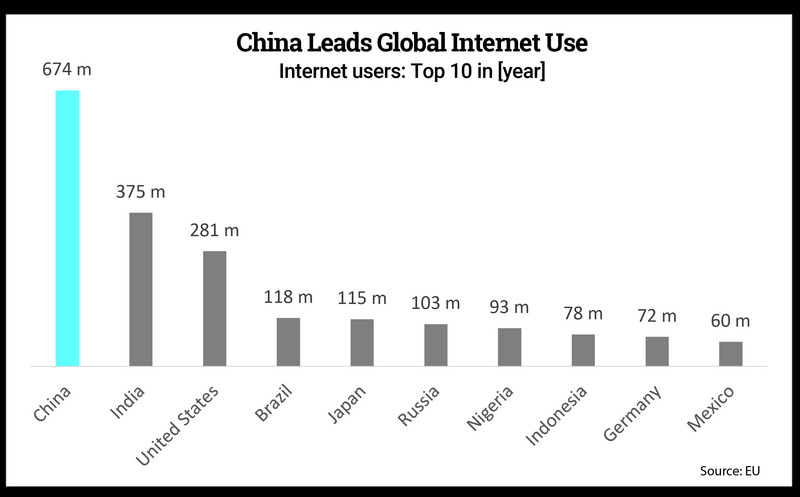
Color: Use a pop of color (such as bright blue) to draw attention while subduing other elements (use gray for those elements).
Color: Use a pop of color (such as bright blue) to draw attention while subduing other elements (use gray for those elements).
Content
Source: The Presentation Company
Source: The Presentation Company
Content
Size: Increase text size, bar width, and line width to emphasize key metrics.
Size: Increase text size, bar width, and line width to emphasize key metrics.
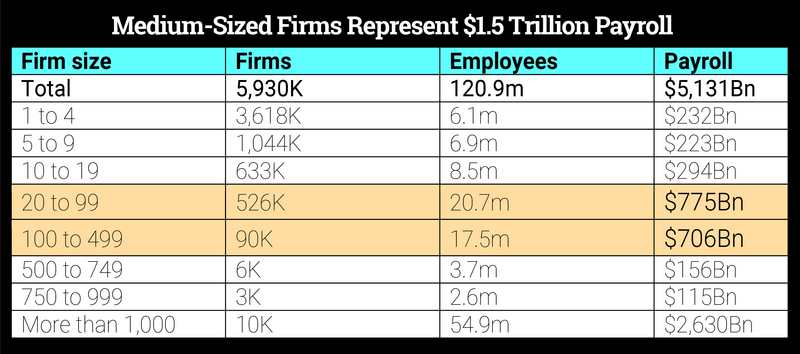
Content
Source: The Presentation Company
Source: The Presentation Company
Content
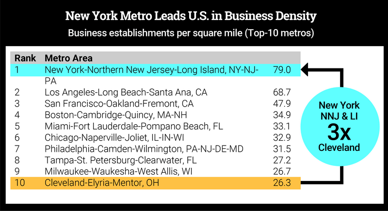
Shapes: Use basic shapes to call out important key data insights.
Shapes: Use basic shapes to call out important key data insights.
Content
Source: The Presentation Company
Source: The Presentation Company
Turn headings into headlines
Content
Don't overlook the text. Imagine each slide or document as a news article.
Don't overlook the text. Imagine each slide or document as a news article.
Content
What is the most significant data insight you want to share? Then develop headlines and let them do the heavy lifting by telling the stakeholders exactly what to conclude about the data they are looking at.
What is the most significant data insight you want to share? Then develop headlines and let them do the heavy lifting by telling the stakeholders exactly what to conclude about the data they are looking at.
Content
Keep headlines short and crisp and compelling and provocative. Include a benefit, cause and effect, or analysis results. For example: "Fuel Costs to Drive Airfares up 25%," "QuickPass Cuts 18 Minutes Off the Average Commute," "Top 2 Movie Distributors Hold 1/3 of Total Market Share."
Keep headlines short and crisp and compelling and provocative. Include a benefit, cause and effect, or analysis results. For example: "Fuel Costs to Drive Airfares up 25%," "QuickPass Cuts 18 Minutes Off the Average Commute," "Top 2 Movie Distributors Hold 1/3 of Total Market Share."
Think outside the chart
Content
Slapping a spreadsheet with lots of bullets on a slide is the opposite of good data visualization. The information will simply wash over stakeholders, causing squints and confusion. Instead, demonstrate the data beyond pie charts and line graphs.
Slapping a spreadsheet with lots of bullets on a slide is the opposite of good data visualization. The information will simply wash over stakeholders, causing squints and confusion. Instead, demonstrate the data beyond pie charts and line graphs.
Content
Photos . An image can be powerful in data storytelling. Photos are memorable and can humanize your data by helping to connect it to your audience on an emotional level.
Photos. An image can be powerful in data storytelling. Photos are memorable and can humanize your data by helping to connect it to your audience on an emotional level.
Content
Icons and other visuals. Try using icons, rather than photos, to represent ideas. Use a combination of oversized numbers, text, and basic shapes to draw the eye to a key data insight and advance the story forward.
Icons and other visuals. Try using icons, rather than photos, to represent ideas. Use a combination of oversized numbers, text, and basic shapes to draw the eye to a key data insight and advance the story forward.
Content
Diagrams. This is a great method for chunking and clustering information into small, digestible concepts using various shapes and colors.
Diagrams. This is a great method for chunking and clustering information into small, digestible concepts using various shapes and colors.
Content
Text. Use big, bold numbers to highlight critical metrics or summarize findings.
Text. Use big, bold numbers to highlight critical metrics or summarize findings.
Content
Video. Incorporate short clips to change the pace, voice, and medium of your data story.
Video. Incorporate short clips to change the pace, voice, and medium of your data story.
Be strategic
Content
Decision makers face a nearly universal problem: too much data and not enough real answers to critical questions. However, when you strategically present data and complex information, you illuminate your ideas and lead decision makers to better, faster outcomes.
Decision makers face a nearly universal problem: too much data and not enough real answers to critical questions. However, when you strategically present data and complex information, you illuminate your ideas and lead decision makers to better, faster outcomes.
Content
When presented poorly, your data can create confusion, leading stakeholders to decode the data themselves, misinterpret your message, and ultimately stall in their next steps. To avoid falling into that credibility trap, remember this mantra: story first, visuals second.
When presented poorly, your data can create confusion, leading stakeholders to decode the data themselves, misinterpret your message, and ultimately stall in their next steps. To avoid falling into that credibility trap, remember this mantra: story first, visuals second.
Content
Combining the art and science of storytelling will take your organization to new heights. In the end, what everyone is craving are insights that help drive innovation, investments, and even hiring decisions. Pushing your organization—in every role or level—toward a culture of meaningful, authentic data storytelling could be the critical move that accelerates growth across your company in the years ahead.
Combining the art and science of storytelling will take your organization to new heights. In the end, what everyone is craving are insights that help drive innovation, investments, and even hiring decisions. Pushing your organization—in every role or level—toward a culture of meaningful, authentic data storytelling could be the critical move that accelerates growth across your company in the years ahead.
Demonstrate Data Relationships
Content
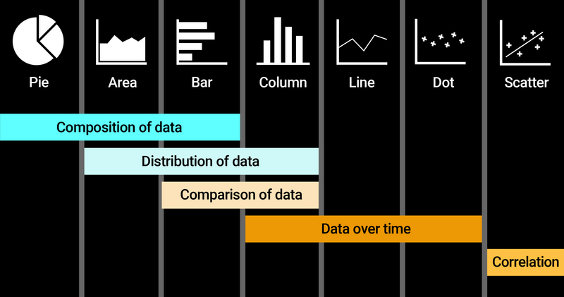
How do you choose a chart or table that will tell a story and drive action? First know that the purpose of all charts is to show the relationships in the data. Then think about which chart or table style best highlights the relationships that fit the data story you are trying to tell.
How do you choose a chart or table that will tell a story and drive action? First know that the purpose of all charts is to show the relationships in the data. Then think about which chart or table style best highlights the relationships that fit the data story you are trying to tell.
Content
Source: The Presentation Company
Source: The Presentation Company
Content
Read more from CTDO magazine : Essential talent development content for C-suite leaders.
Read more from CTDO magazine: Essential talent development content for C-suite leaders.